Goals: Enhance the shopping experience and position Descomplica as a top-tier graduate education provider.
Role: Sole UX Designer leading desk research, benchmarking, wireframing, prototyping, and log analysis. Collaborated with developers, a UX writer, and an outsourced usability testing team.
Results:

Gif from the redesigned mobile website.

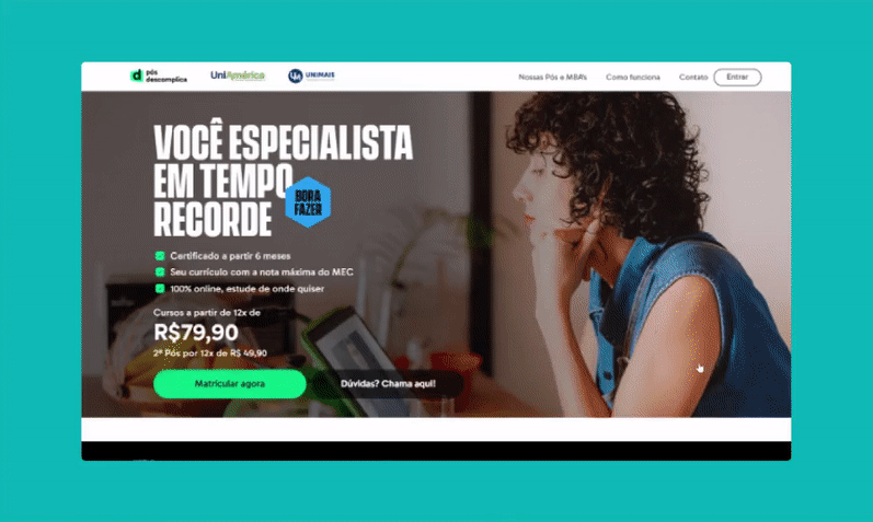
Gif from the redesigned desktop website.
• Descomplica stands out for its affordability and accessible online courses compared to competitors.
• The majority of students come from lower-income backgrounds.
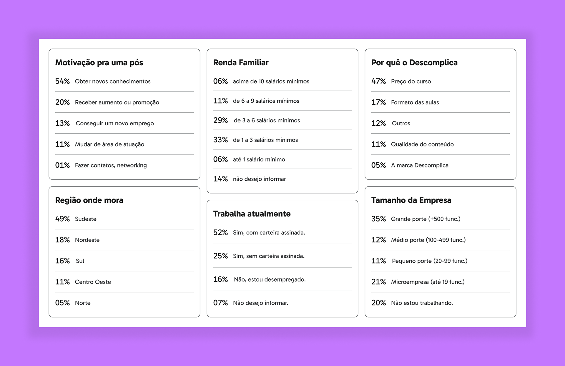
Report showing data from current Descomplica Postgraduate students.
• Ensure users can easily find a list of majors and programs.
• Highlight the institution’s strengths and achievements.
• Include information on job placement after graduation.
• Avoid prioritizing a “cool” design at the expense of usability.

Article about University Websites from the Nielsen Norman Group.
• Enable quick product comparisons.
• Offer honest reviews.
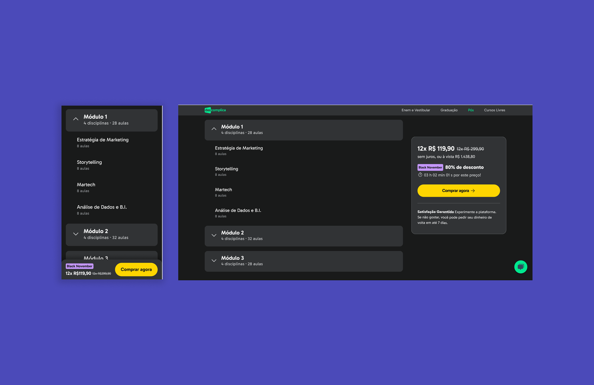
• Simplify the payment process.
• Reduce interaction costs.
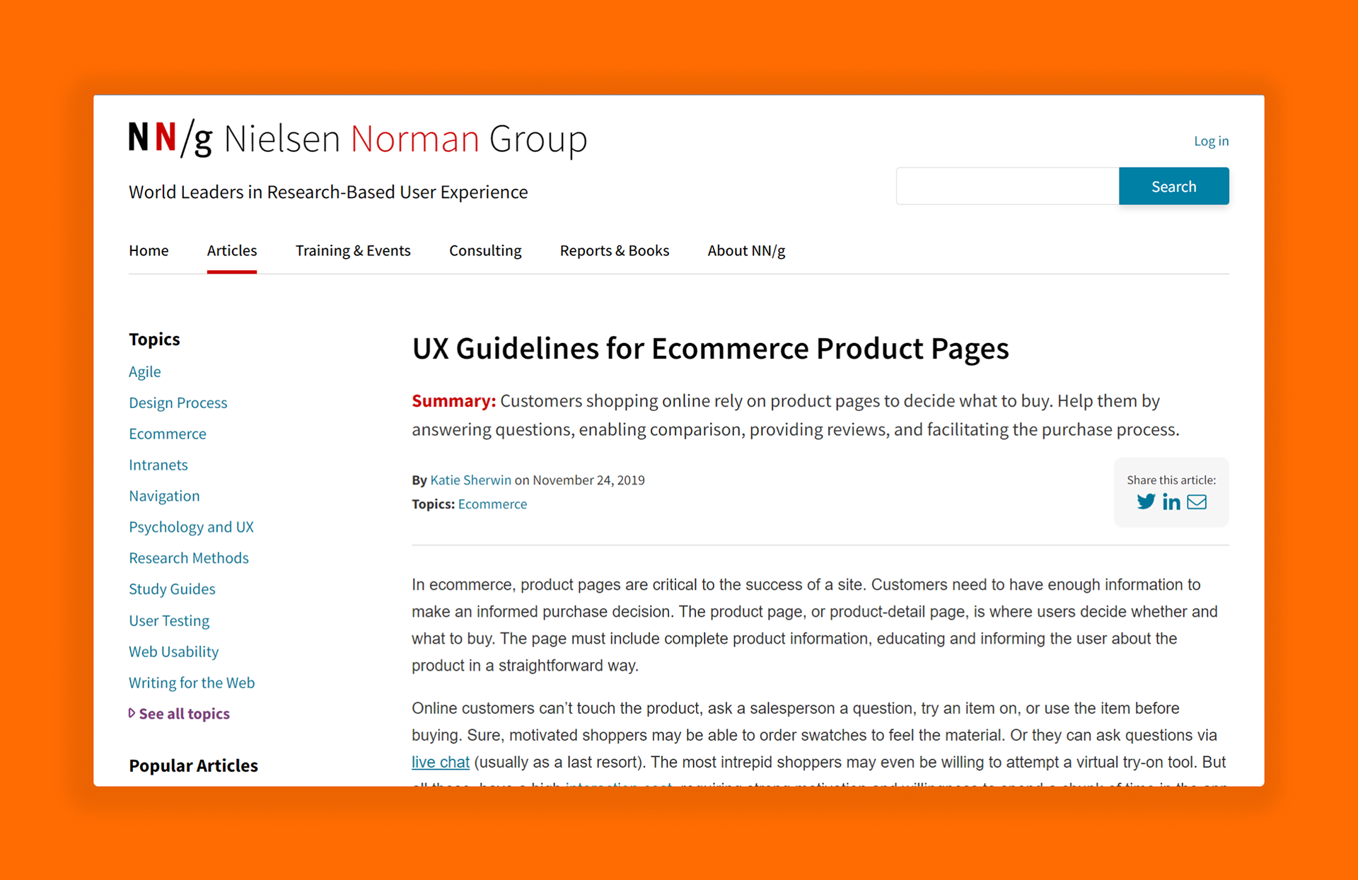
Article about eCommerce product pages from the Nielsen Norman Group.
• Problems accessing a second course in combo purchases.
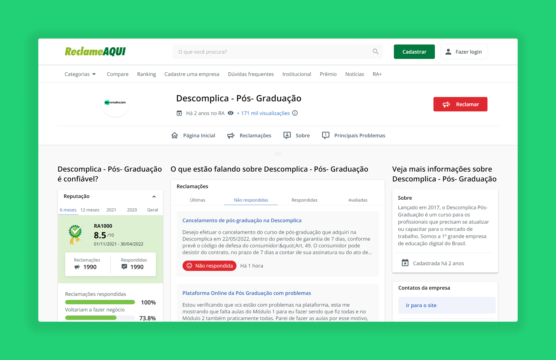
Print from Reclame Aqui's website to where complaints about Descomplica were posted (the most popular website for product/service public reviews in Brazil)
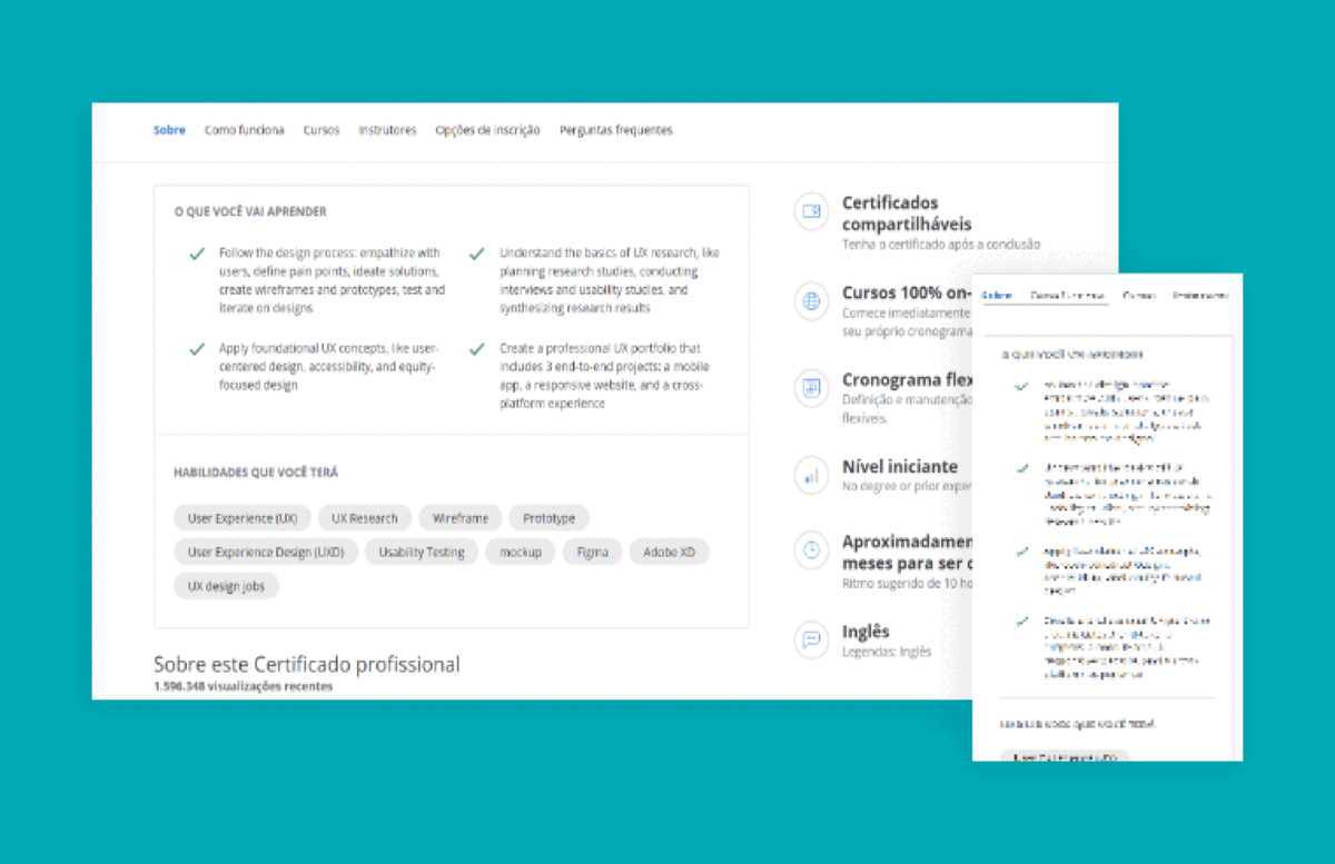
Prints from reference companies in the education market (Masterclass, Udemy, Coursera, Skillshare, Ebac.)

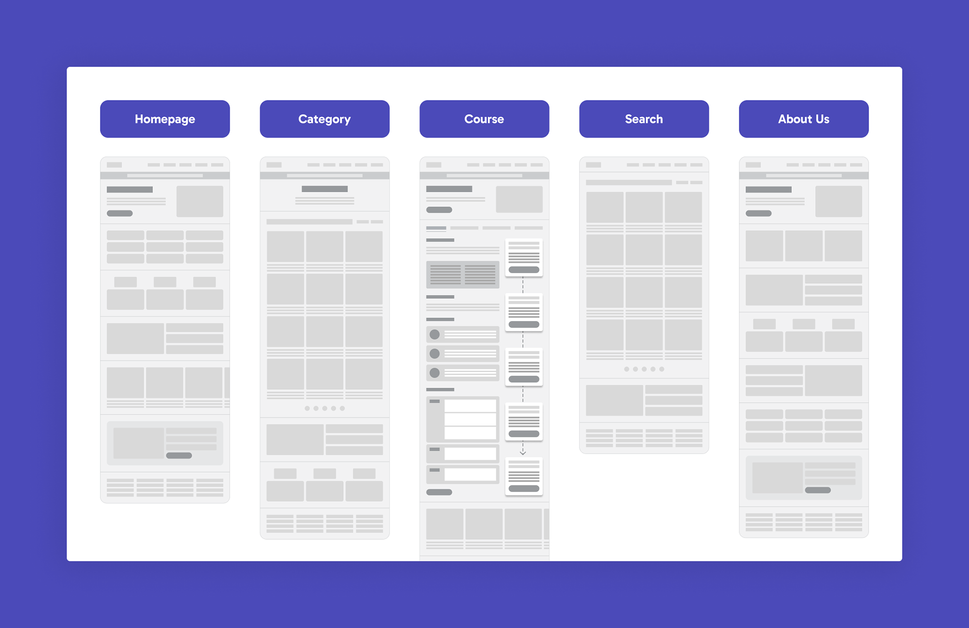
The sitemap shows the site pages and connections: Homepage, Category Page, Course Page, Search Page, and About Page. For new customers, the main action is to find a course and buy it. A second one is to fill out a form to become a lead. For those who are already a postgraduate student, the main action is to access the platform.
Lo-Fi desktop wireframes showing possible sections and orders on each page of the site.

Examples of updated branding assets: logo, neutral colors (dark background) and brand promotional photos.

Click the top-right corner of the embedded window to view the desktop prototype in full screen.
• Initial interview, usability test with free navigation, and final interview
• 15 tests on desktop + 12 on mobile
• Age groups: 22-24 (25%), 25-34 (50%), 35-44 (25%)
• Gender: 60% women, 40% men
• All participants from Class C or D (lower class)
• Interested in enrolling in online postgraduate courses in Law, Engineering, Health, Technology, Management, Education, and/or Marketing
• “It’s very intuitive, but I think it could have more information.”
• “I would highlight the duration of the course.”
• “I like the design, big buttons, and easy navigation. However, I didn’t like having to register to see the Course Program.”

A new section displays national average salaries for the relevant profession, along with state-specific salaries after the user completes the personal data form.

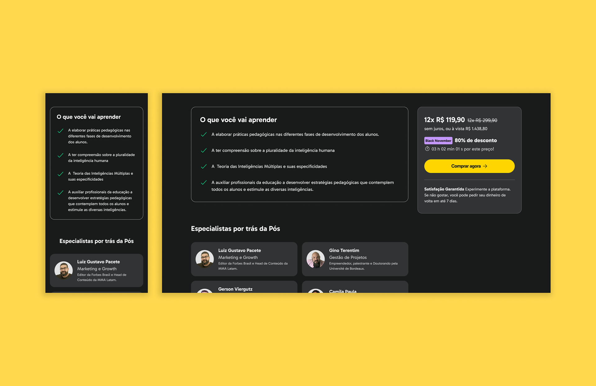
In collaboration with the pedagogical team, we added a summarized checklist of course learnings
• Onboarding → ‘Course Introduction’
• Coach → ‘Professional Support’
• Checkout → ‘Carrinho’ (Cart)
We removed partner university logos from the header to prioritize Descomplica’s brand.
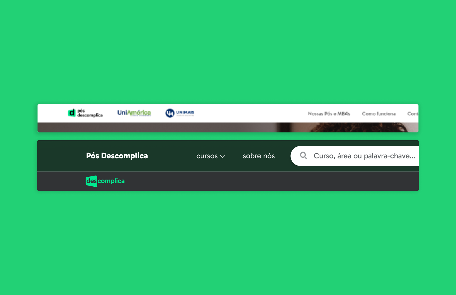
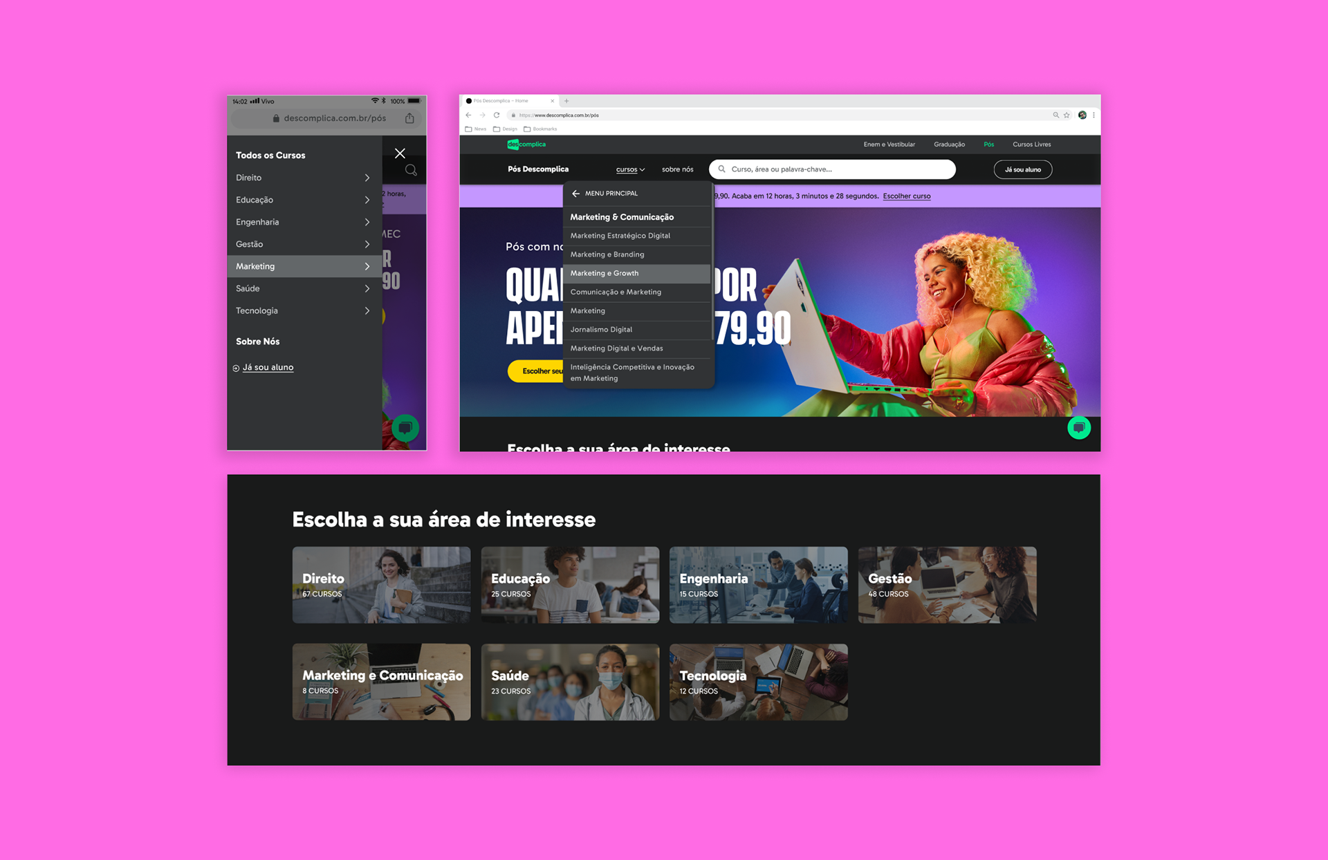
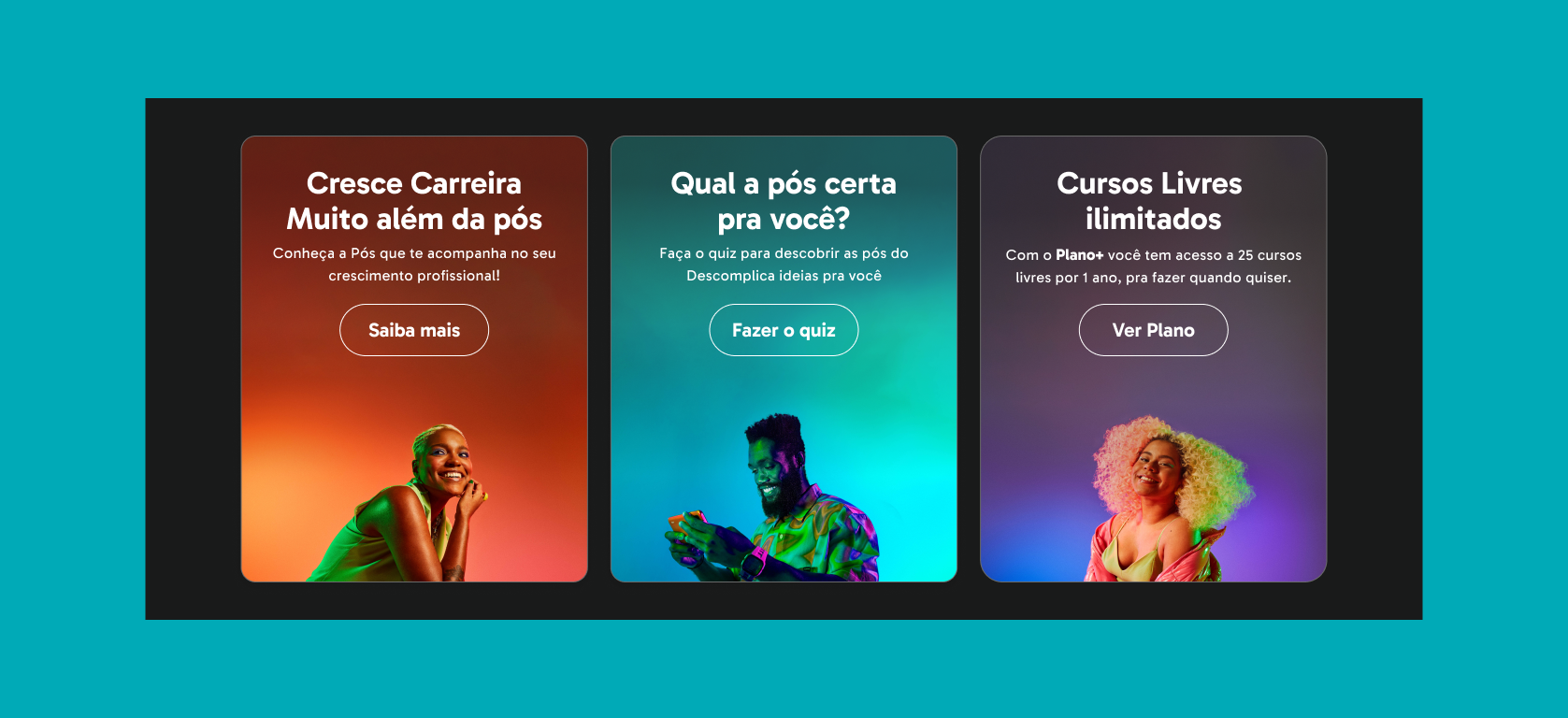
We added a dropdown menu on desktop and a lateral menu on mobile for course categories. A course categories section was also placed prominently on the homepage after the hero section.
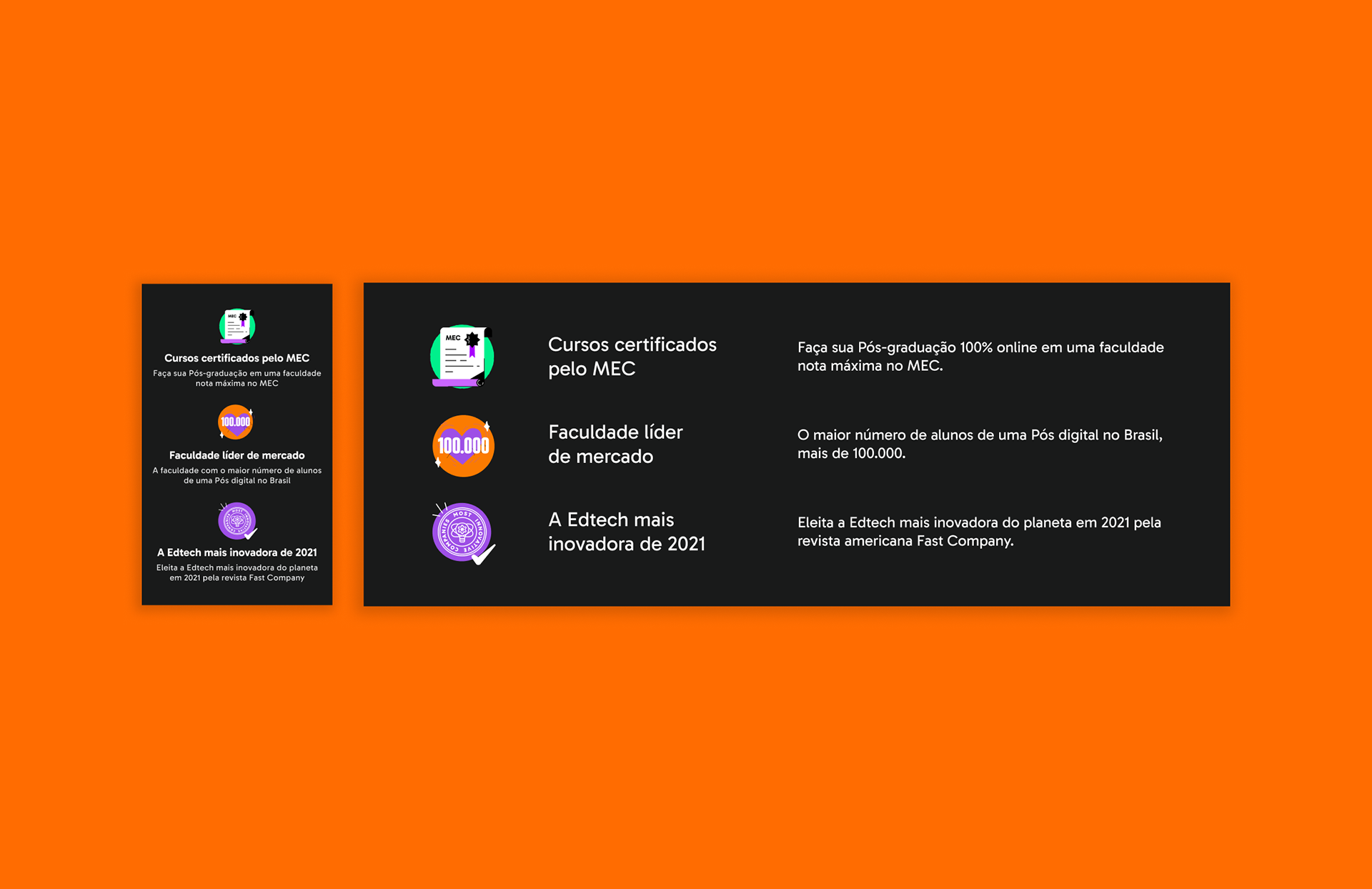
A new section emphasizes:
• Courses certified by the Ministry of Education
• Over 100,000 postgraduate students
• Recognition by Fast Company as one of the most innovative companies
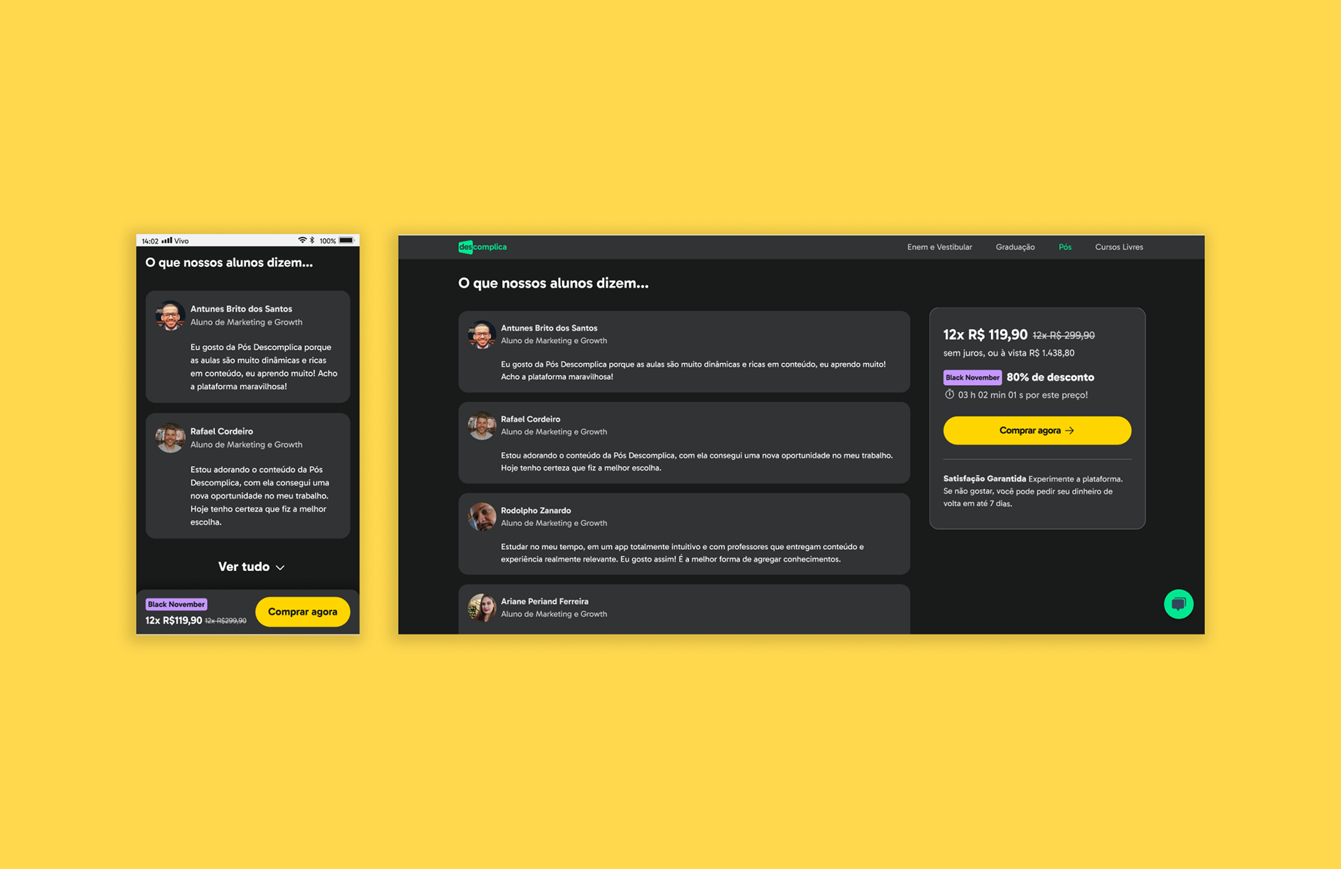
Due to a lack of course-specific reviews and concerns about conversion rates, we designed a section for general institutional reviews, sourced from external platforms (e.g., Google Reviews, Reclame Aqui).
After implementing adjustments based on usability test data, the development team adapted and simplified several components to meet deadlines. All changes are being gradually rolled out.
A/B Testing
We ran a test comparing the ‘previous design’ with the ‘new design’ (50/50 split). Results after a few weeks showed the ‘new design’ performed better:
• Booking rates ↑ 35%
• Lead capture rate ↑ 17%