Summary
Development of the design system for Descomplica, Brazil’s largest EdTech.
Goals
Role
Goals
1. Deliver the first version of Descomplica’s Design System, including tokens, basic components, and specialized components for product and marketing teams.
2. Streamline design and development processes.
3. Ensure consistency across interfaces, codebases, and user experiences throughout the company.
4. Centralize and document components, best practices, and lessons learned for scalability.
5. Plan the system’s roadmap, governance, and communication channels.
Role
UX Designer representative for the Marketing team, collaborating with a product design representative, design director, and development team.
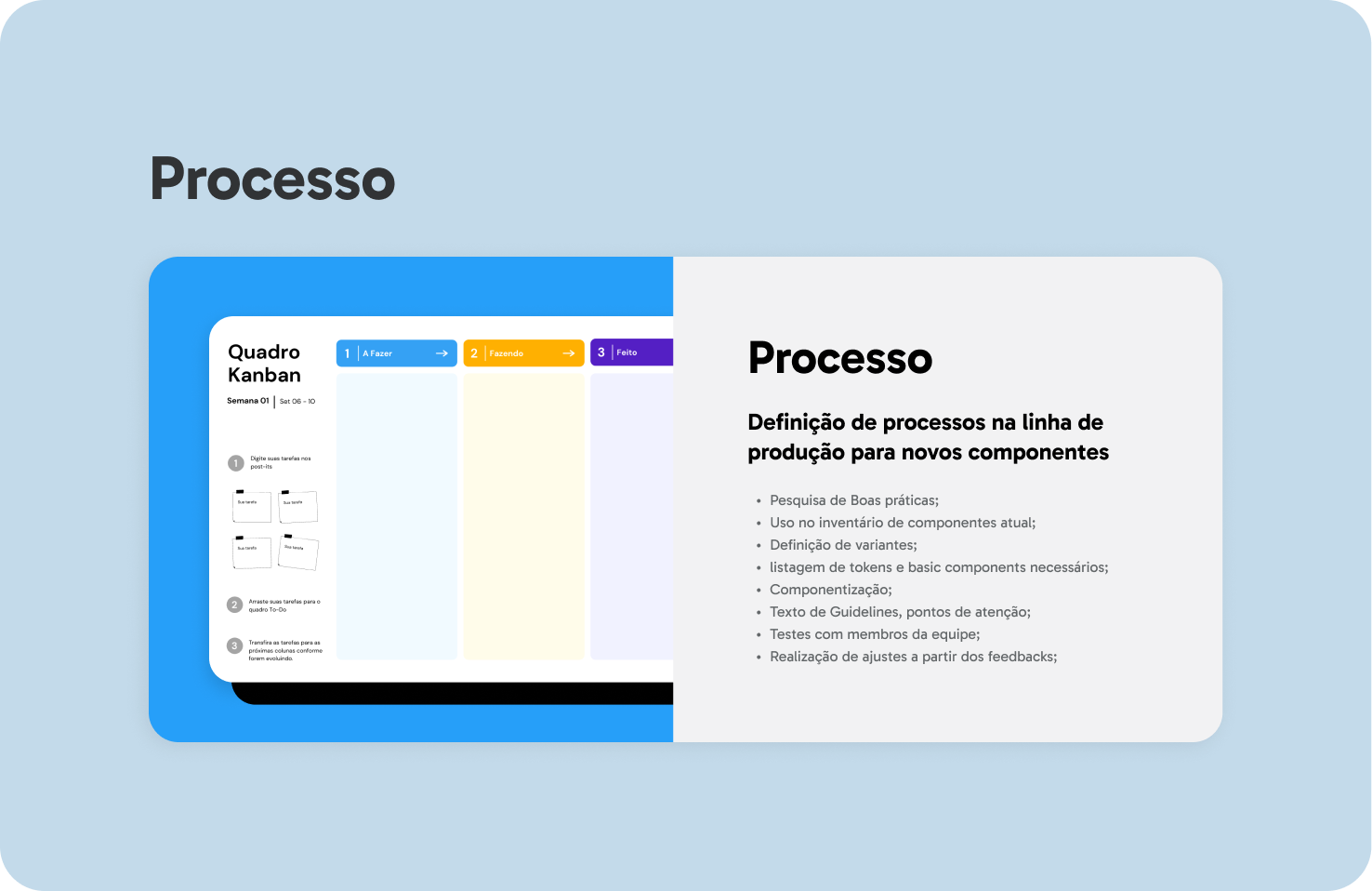
Process
The first version of the Design System (DS) was launched in April 2022 after iterative collaboration and adjustments. It is being actively promoted among design and development teams, with plans for updates following internal feedback and analytics insights.
1. Mapping Organizational Context
2. Component Inventory
3. System Architecture
4. Roadmap Development
5. Establishing Design Principles
6. Creating Design Tokens
7. Developing Components
8. Documentation
9. Communication Strategy
10. Analytics & Continuous Optimization
The first version of the Design System (DS) was launched in April 2022 after iterative collaboration and adjustments. It is being actively promoted among design and development teams, with plans for updates following internal feedback and analytics insights.
Project Introduction & Context
Descomplica is Brazil’s largest EdTech, initially focused on preparatory courses for university admissions exams (ENEM & Vestibulares). It later expanded to include undergraduate, graduate programs, and open courses.
Design operations at Descomplica were fragmented among teams focusing on products, branding, and marketing (CRO, CRM, and Social Media). During my tenure in the CRO team, I observed inconsistencies in design processes, component usage, and file organization. These inefficiencies hindered cross-team collaboration and delayed project timelines.
Challenges
1. Lack of a centralized design system or shared component library.
2. Inconsistent file organization across teams, leading to redundant components and duplicated work.
3. Limited documentation of design standards, causing frequent knowledge loss.
4. No dedicated Design Ops team to oversee operations or foster cross-team alignment.
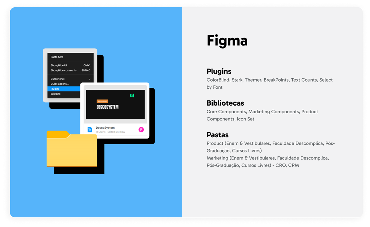
Component Inventory
To address these issues, we created a comprehensive inventory of components used across various teams.
Process:
• Gathered screens from key interfaces (LMS, CRO, CRM, Checkout).
• Identified frequently used components and documented team-specific and shared needs.
• Categorized components into Core, Marketing, and Product libraries:
Process:
• Gathered screens from key interfaces (LMS, CRO, CRM, Checkout).
• Identified frequently used components and documented team-specific and shared needs.
• Categorized components into Core, Marketing, and Product libraries:
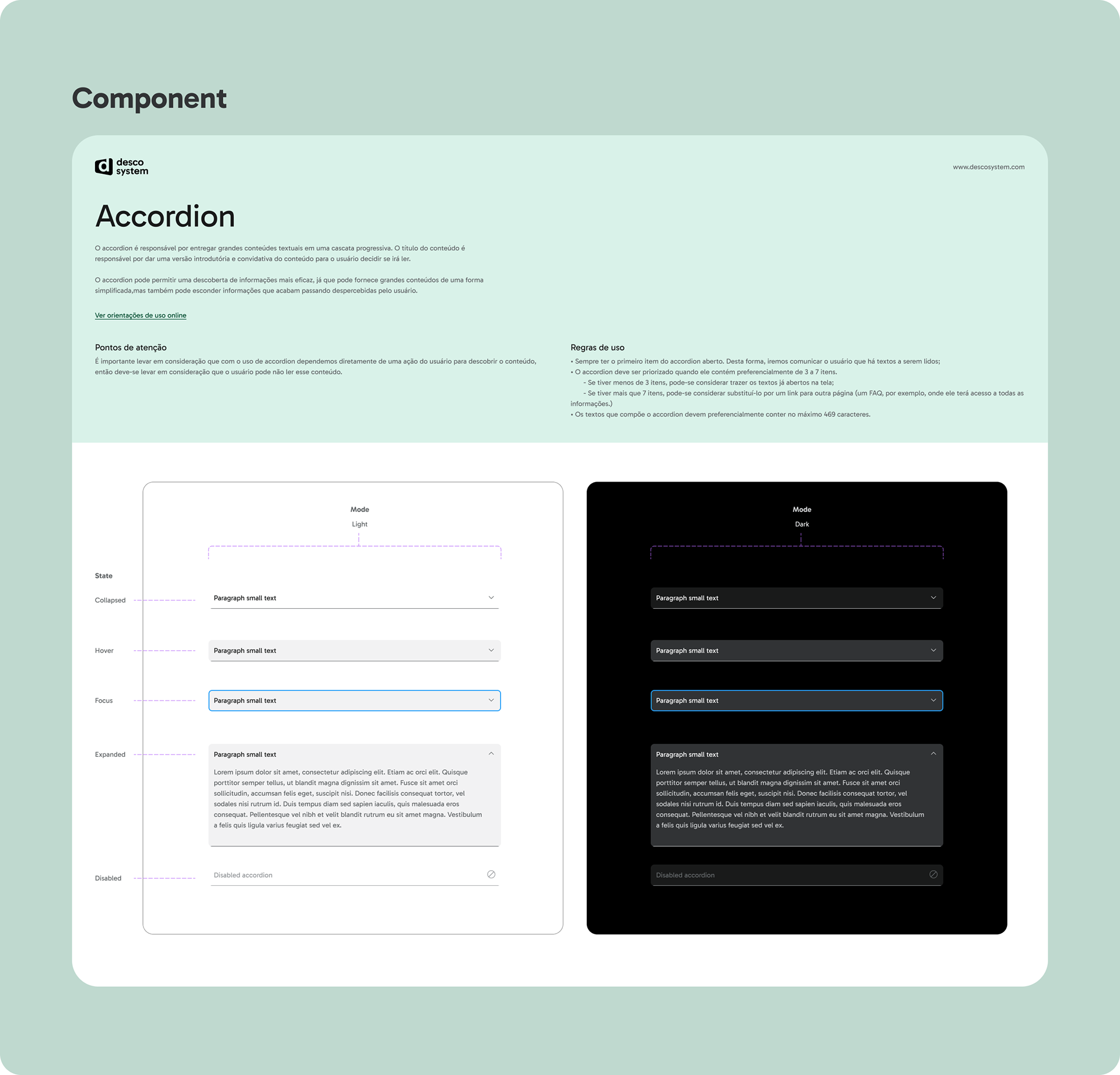
Core Components: Shared by all teams.
Examples: Accordion, Alert, Buttons, Modals, Tabs, Tooltips.
Examples: Accordion, Alert, Buttons, Modals, Tabs, Tooltips.
Marketing Components: Tailored for lead generation and conversion optimization.
Examples: Hellobar, Countdown, Exit Intent, Marketing-specific CTAs.
Examples: Hellobar, Countdown, Exit Intent, Marketing-specific CTAs.
Product Components: Focused on the LMS and educational experiences.
Examples: Notification, Steps, Text Area Inputs.
Examples: Notification, Steps, Text Area Inputs.
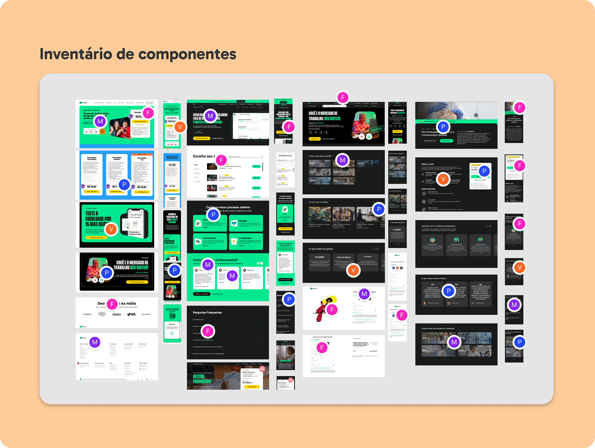
Component Inventory: we analyzed the most frequent components and styles in Marketing and Product's interfaces.
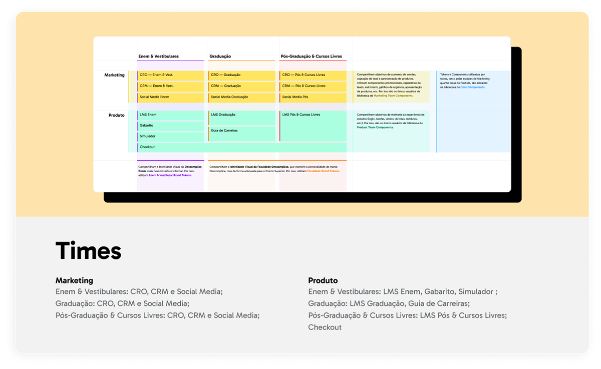
System's Architecture
The architecture reflected Descomplica’s organizational structure:
1. Core Components
Used universally across all teams.
Used universally across all teams.
2. Team Components
Specific to Marketing or Product teams.
Specific to Marketing or Product teams.
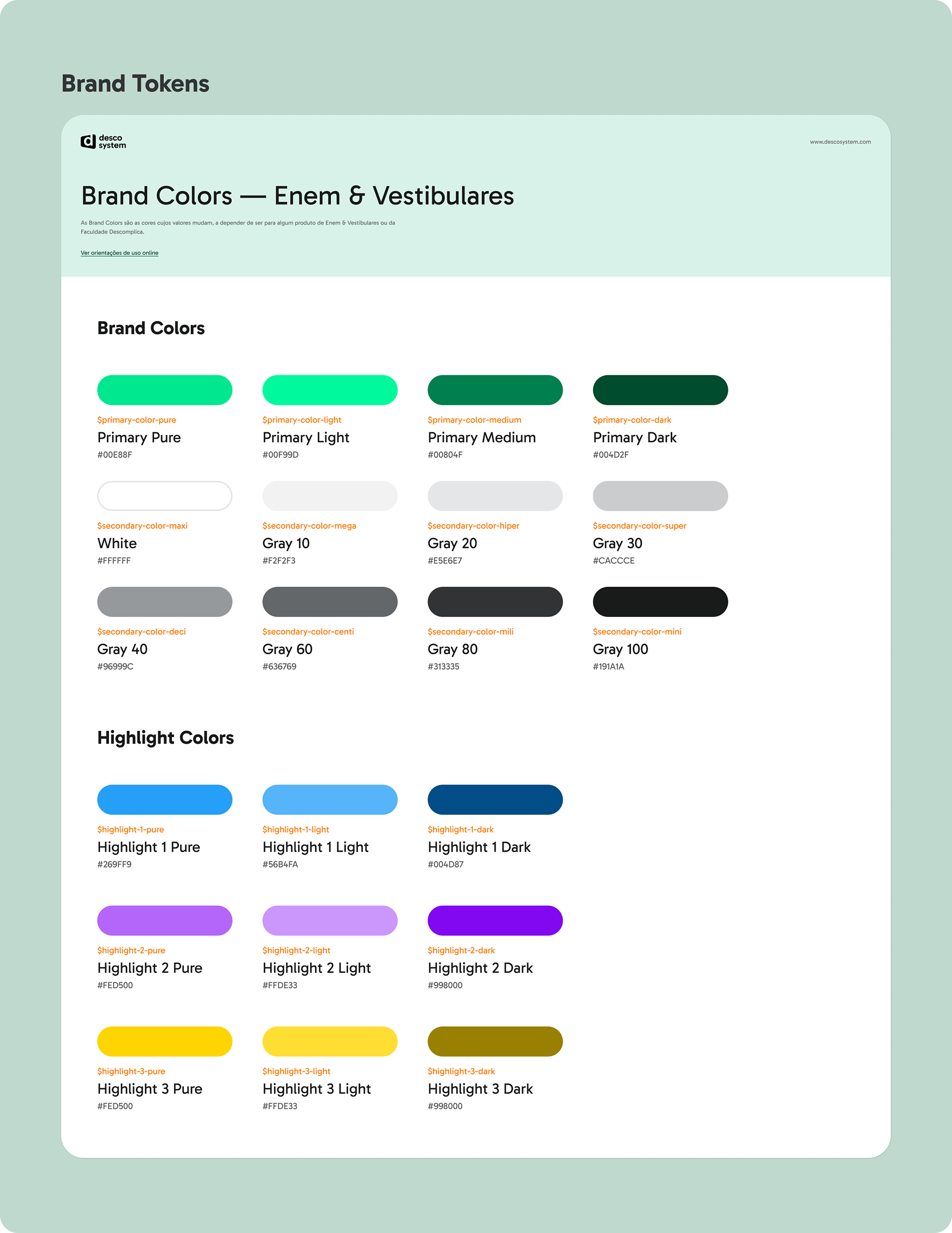
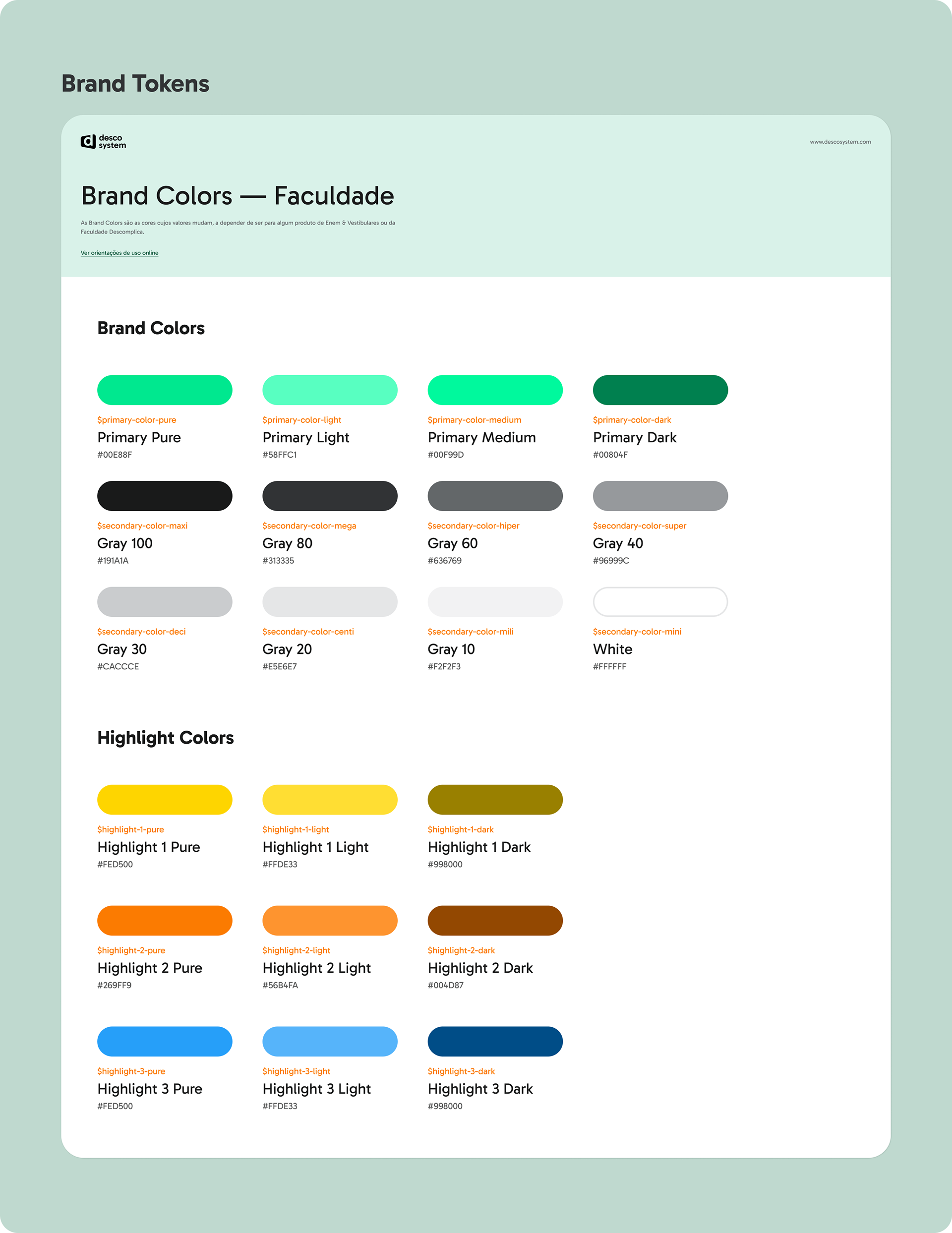
3. Design Tokens
Divided into:
• Global Tokens: Shared across all teams (e.g., spacing, typography).
• Brand Tokens: Differentiated for ENEM & Vestibulares (light themes) and Undergraduate/Graduate programs (dark themes).
Divided into:
• Global Tokens: Shared across all teams (e.g., spacing, typography).
• Brand Tokens: Differentiated for ENEM & Vestibulares (light themes) and Undergraduate/Graduate programs (dark themes).
Implementation
Tokens and components were built for React and Vue frameworks, with consistent naming conventions such as Component + Variant + Platform.
Tokens and components were built for React and Vue frameworks, with consistent naming conventions such as Component + Variant + Platform.
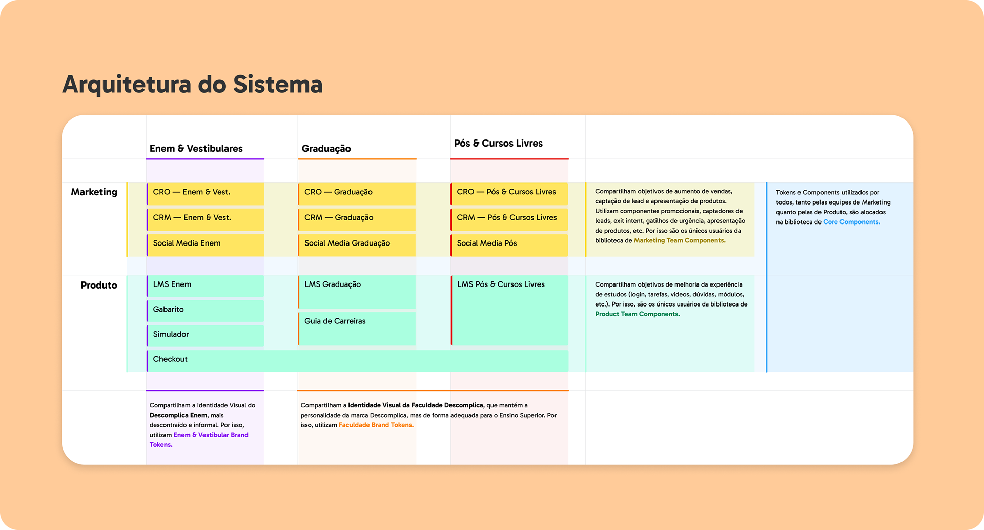
Token organization and component library, according to the Descomplica's sectors that use design assets and work on development.
Design Principles
In collaboration with the Branding team, we established principles to guide design decisions:
Universal
Inclusive, accessible, and functional for all users, devices, and cultural contexts.
Inclusive, accessible, and functional for all users, devices, and cultural contexts.
Fun
Promote learning as an enjoyable and engaging experience.
Promote learning as an enjoyable and engaging experience.

Human
Prioritize honesty, respect, and empathy in all interactions.
Prioritize honesty, respect, and empathy in all interactions.

Objective
Communicate clearly and simplify user journeys to respect their time and attention.
Communicate clearly and simplify user journeys to respect their time and attention.
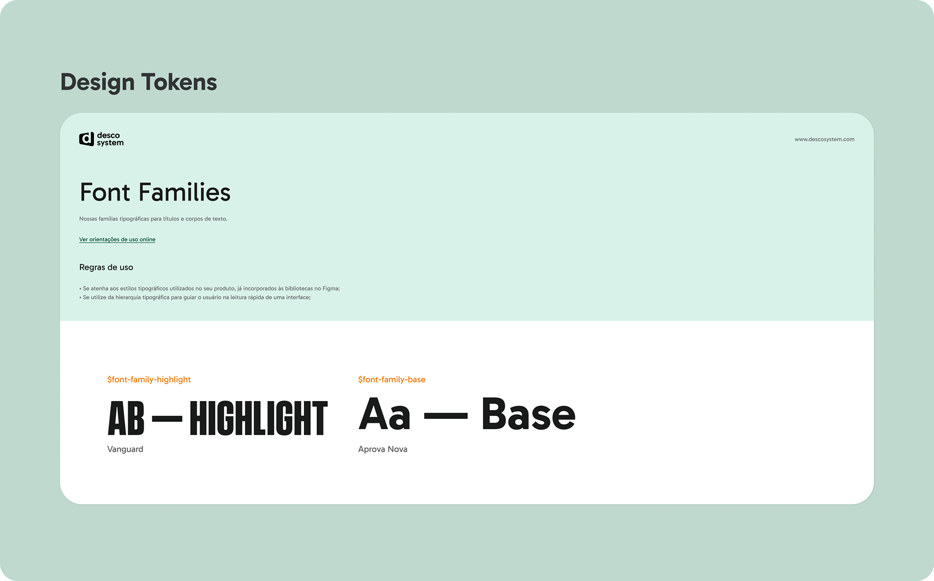
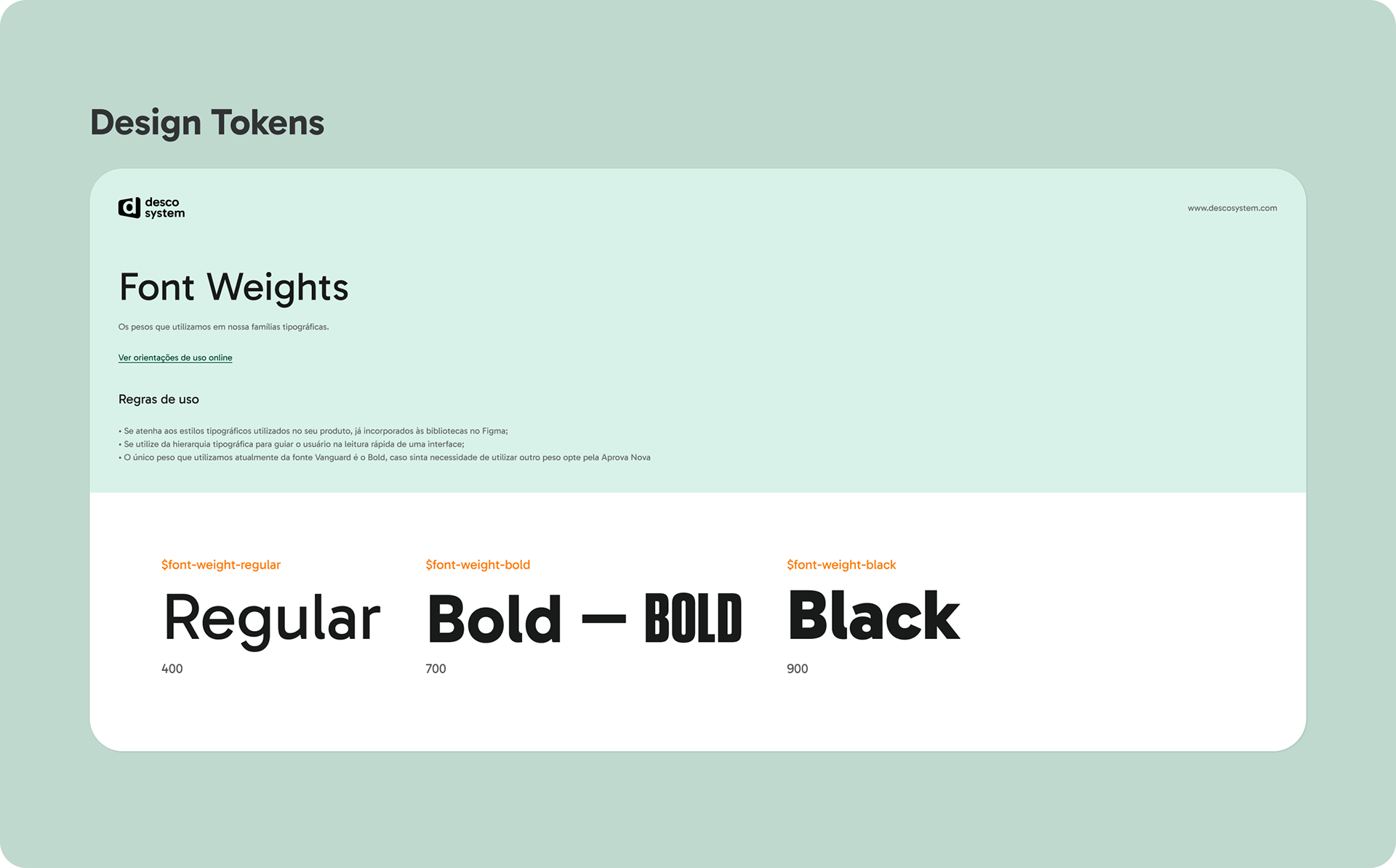
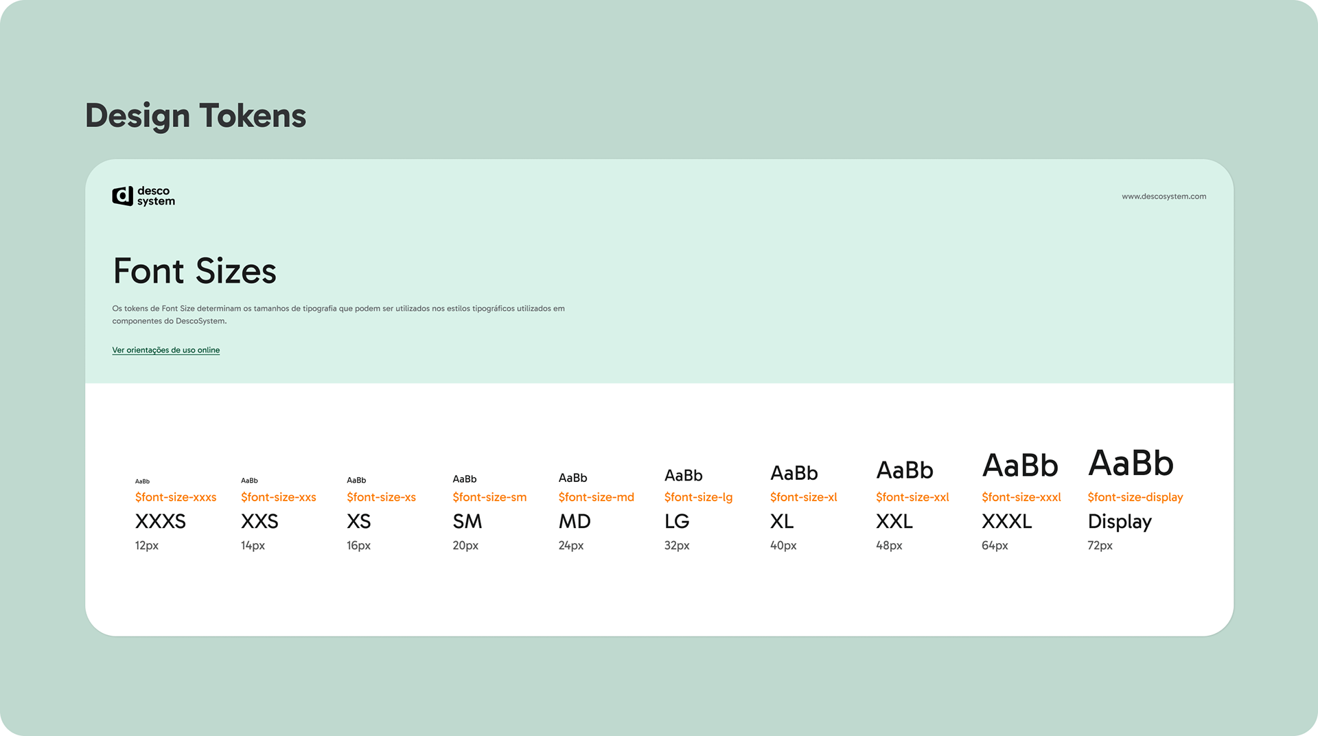
Design Tokens
Tokens formed the foundation of the system:
Consistent across all teams (e.g., colors, typography, spacing).
Brand Tokens
Customized for different educational segments with light/dark variations.
Customized for different educational segments with light/dark variations.
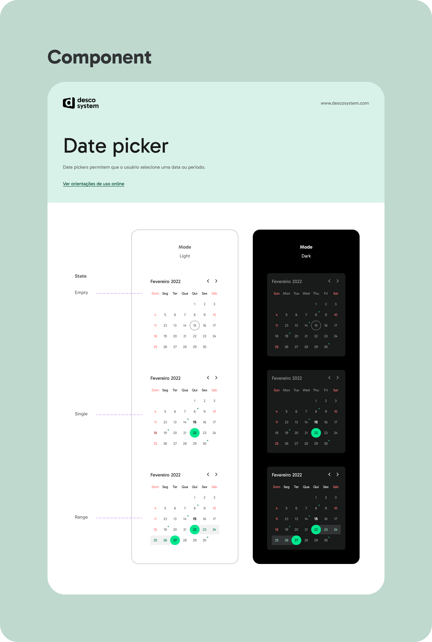
Components
Core Components


Team Components
Marketing Components

Product Components

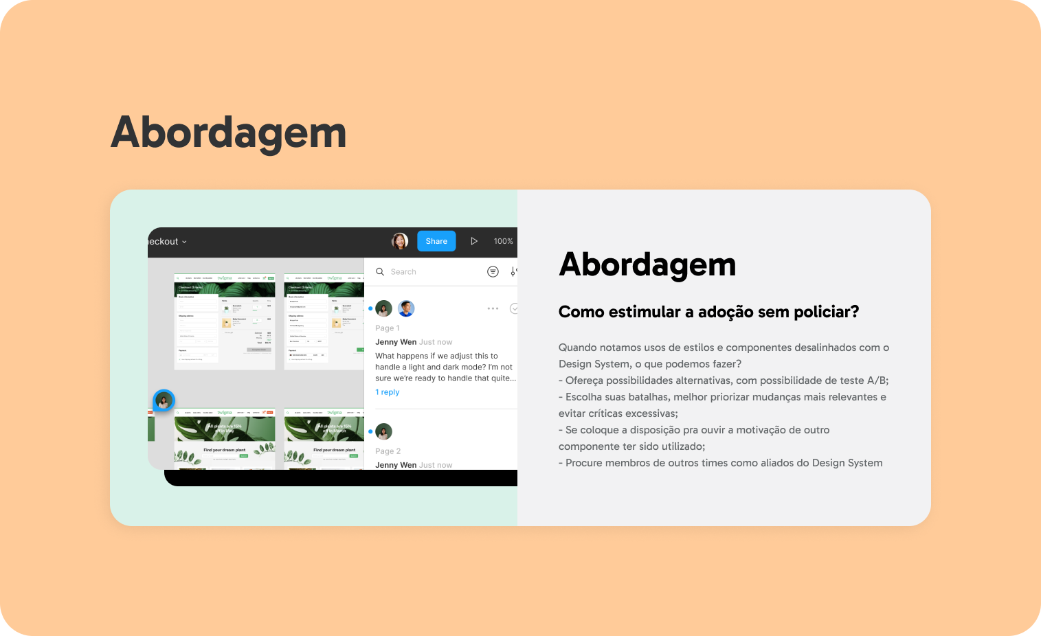
Communication & Strategy
Internal communication focused on promoting adoption and gathering feedback. Key initiatives included:
• Onboarding guides for new hires to familiarize them with the system.
• Regular updates and announcements about system enhancements.
• Feedback loops through analytics and usage data in Figma.
• Onboarding guides for new hires to familiarize them with the system.
• Regular updates and announcements about system enhancements.
• Feedback loops through analytics and usage data in Figma.
Onboarding & Design Ops
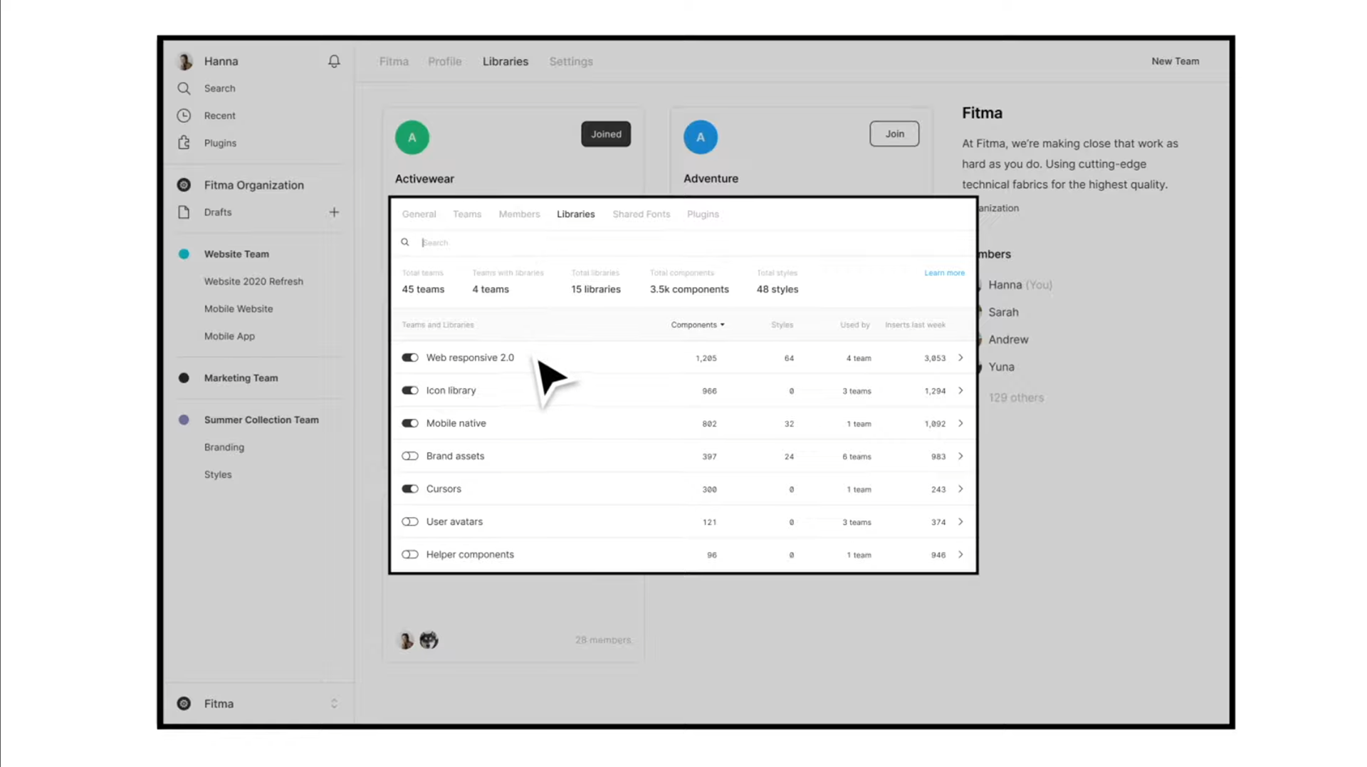
Initial instructions for new employees were developed so those could help people adopt a frequent and regular use of the design system and better manage its files, folders, and libraries.
Initial instructions for new employees were developed so those could help people adopt a frequent and regular use of the design system and better manage its files, folders, and libraries.


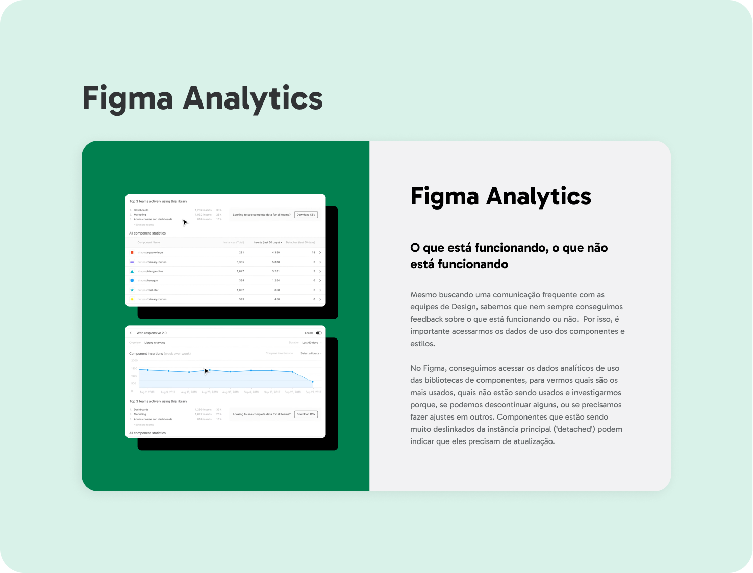
Analytics & Continuous Optimization
Analytics Insights
• Figma usage data helped identify underused components for improvement or discontinuation.
• Comparison of library adoption rates revealed gaps in team utilization and areas for better communication.
• Figma usage data helped identify underused components for improvement or discontinuation.
• Comparison of library adoption rates revealed gaps in team utilization and areas for better communication.
Optimization Plan
• Early adopters from Product and Marketing teams provided qualitative feedback.
• Iterative improvements were based on component performance and team feedback.
• Early adopters from Product and Marketing teams provided qualitative feedback.
• Iterative improvements were based on component performance and team feedback.
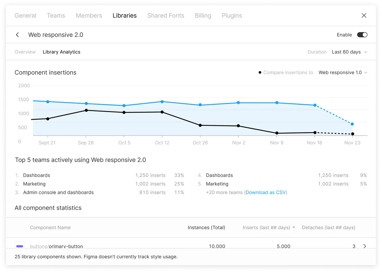
How Libraries are used
Como as bibliotecas estão sendo usadas
It is possible to compare the use of 2 or more libraries in a period of time and then compare it to the adoption of a new library and the discontinuation of an old one.
It is possible to compare the use of 2 or more libraries in a period of time and then compare it to the adoption of a new library and the discontinuation of an old one.
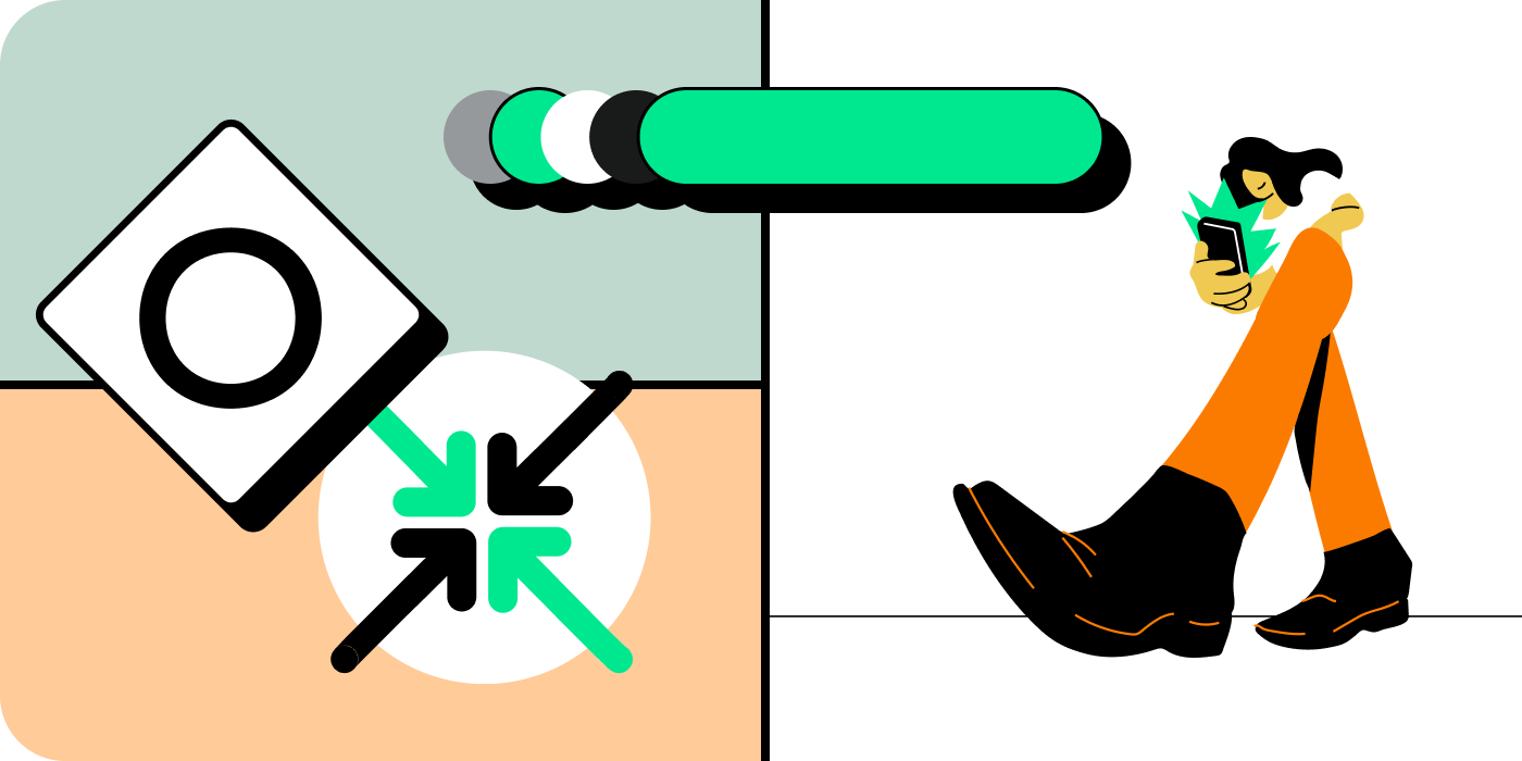
The design system data usage analysis can help us mesure the adoption of libraries in the beginning of the development process of the design system and give insight on the next releases.
Results & Next Steps
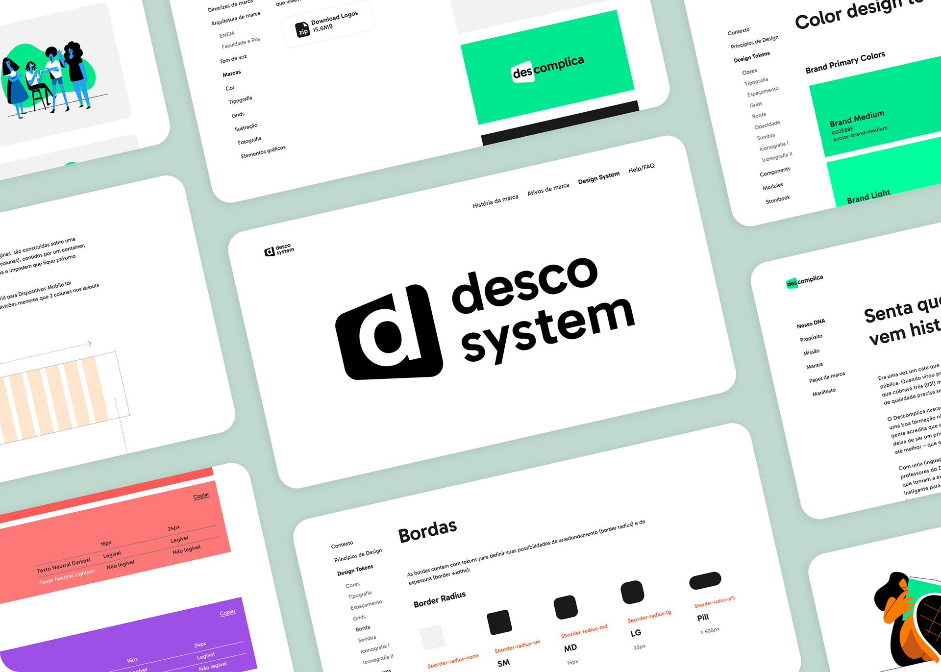
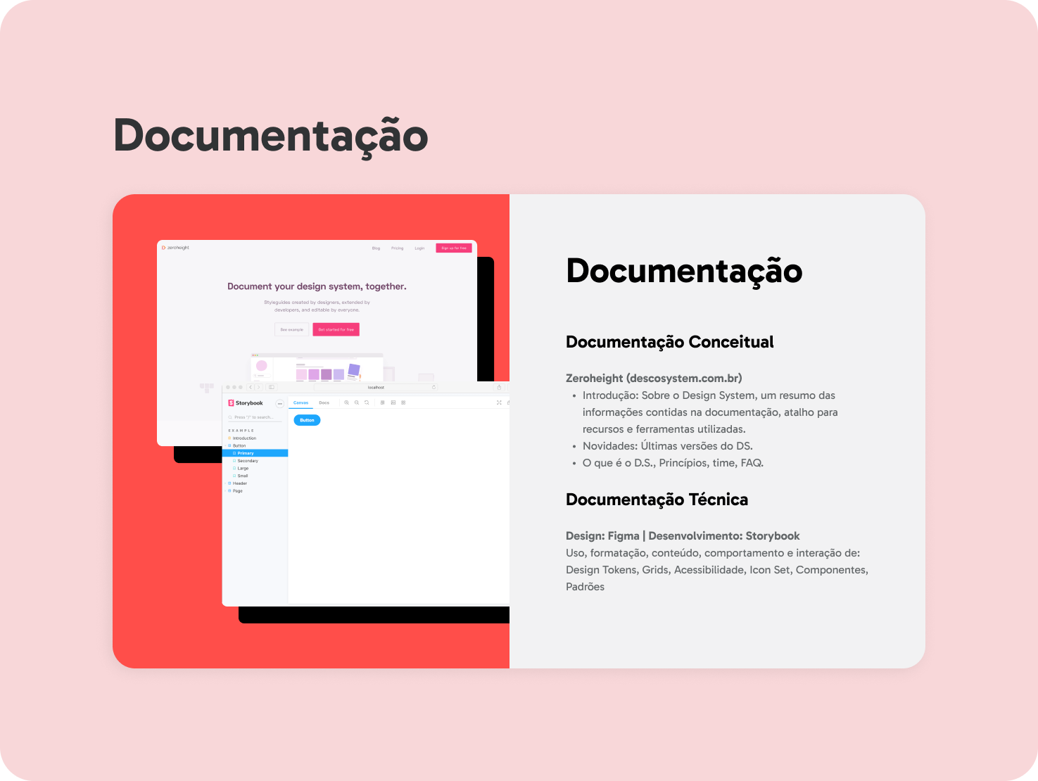
Technical Documentation
Figma + Storybook
Figma + Storybook
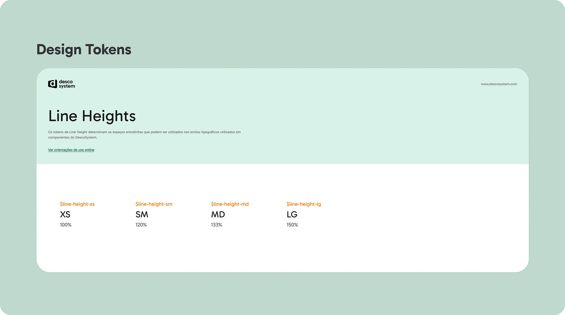
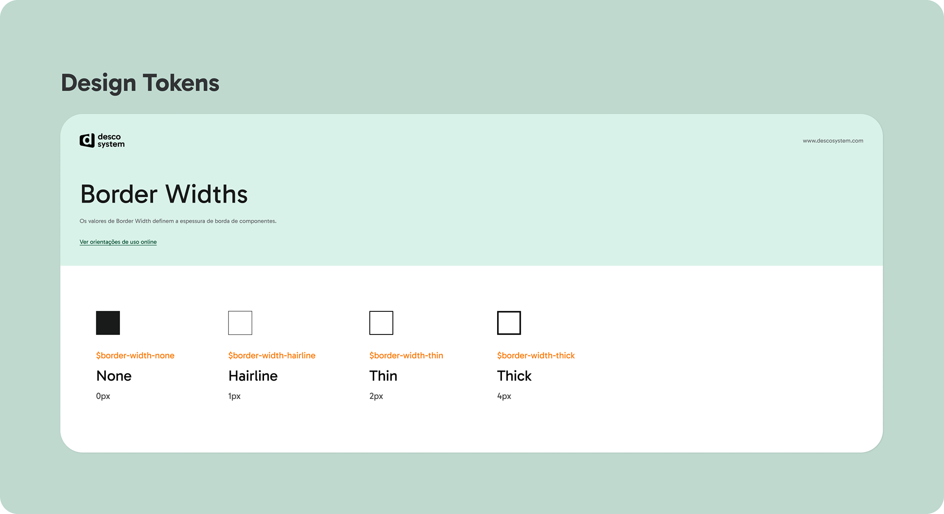
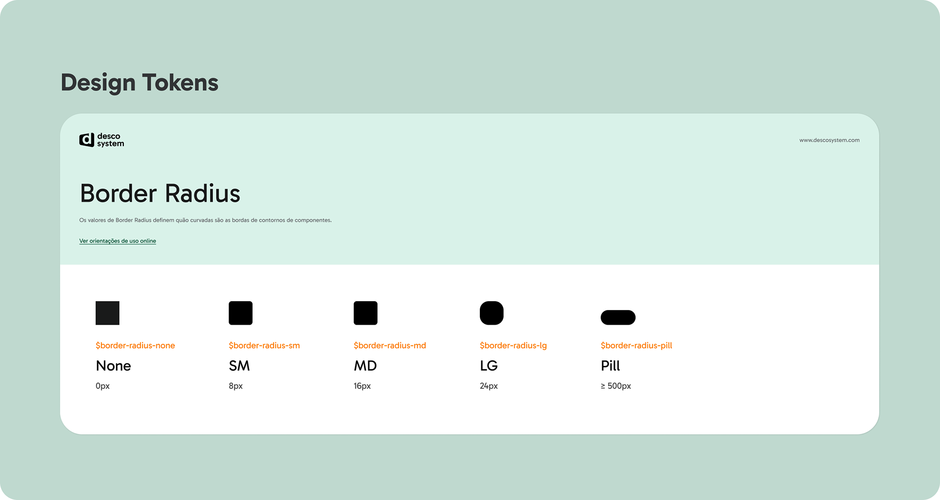
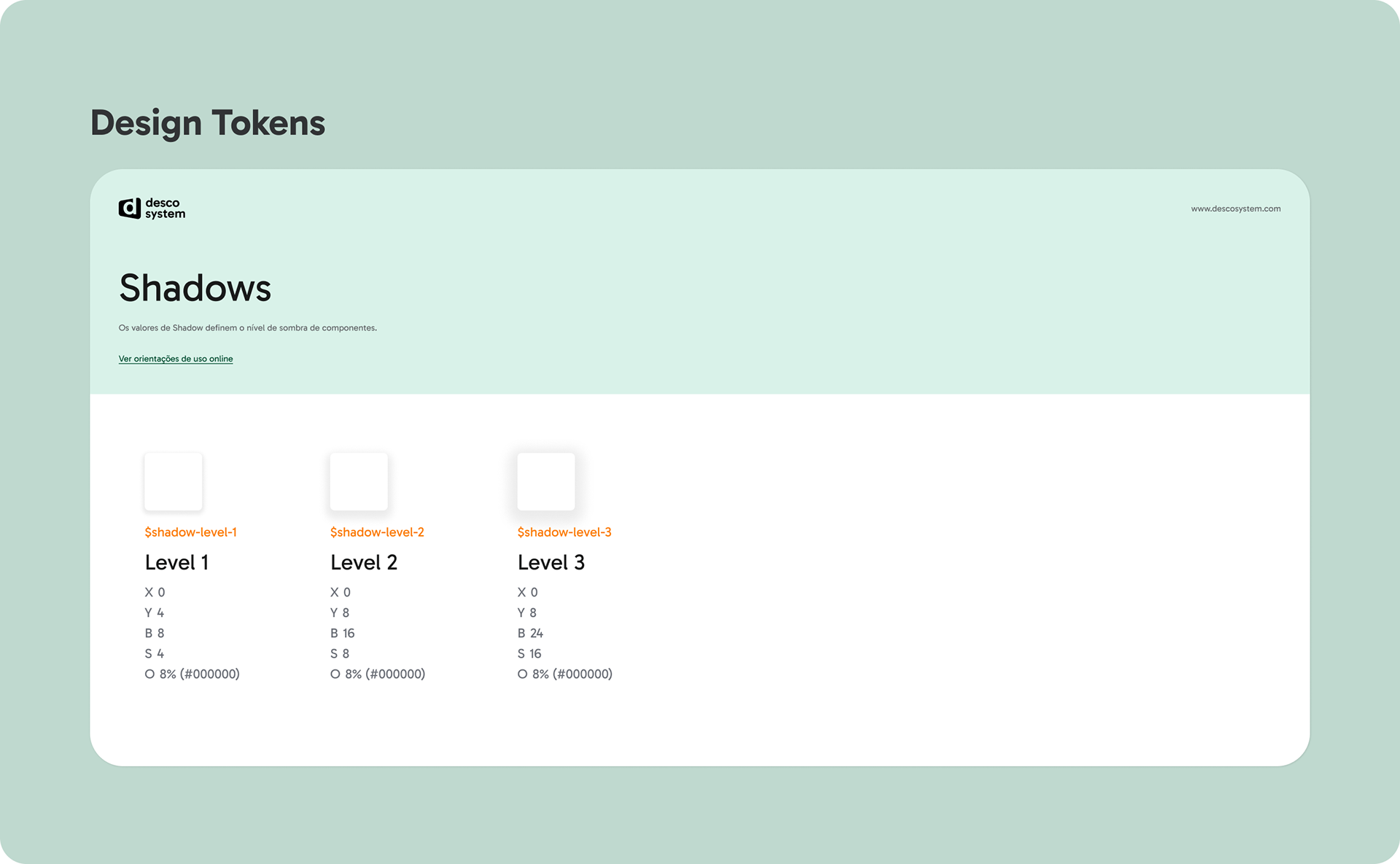
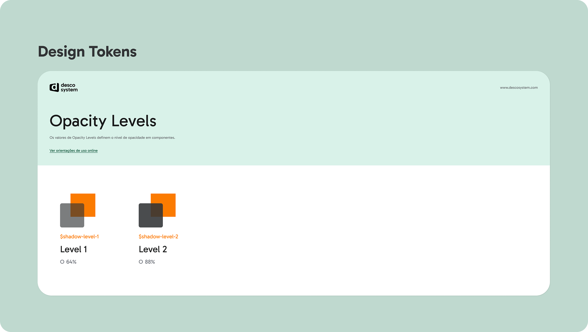
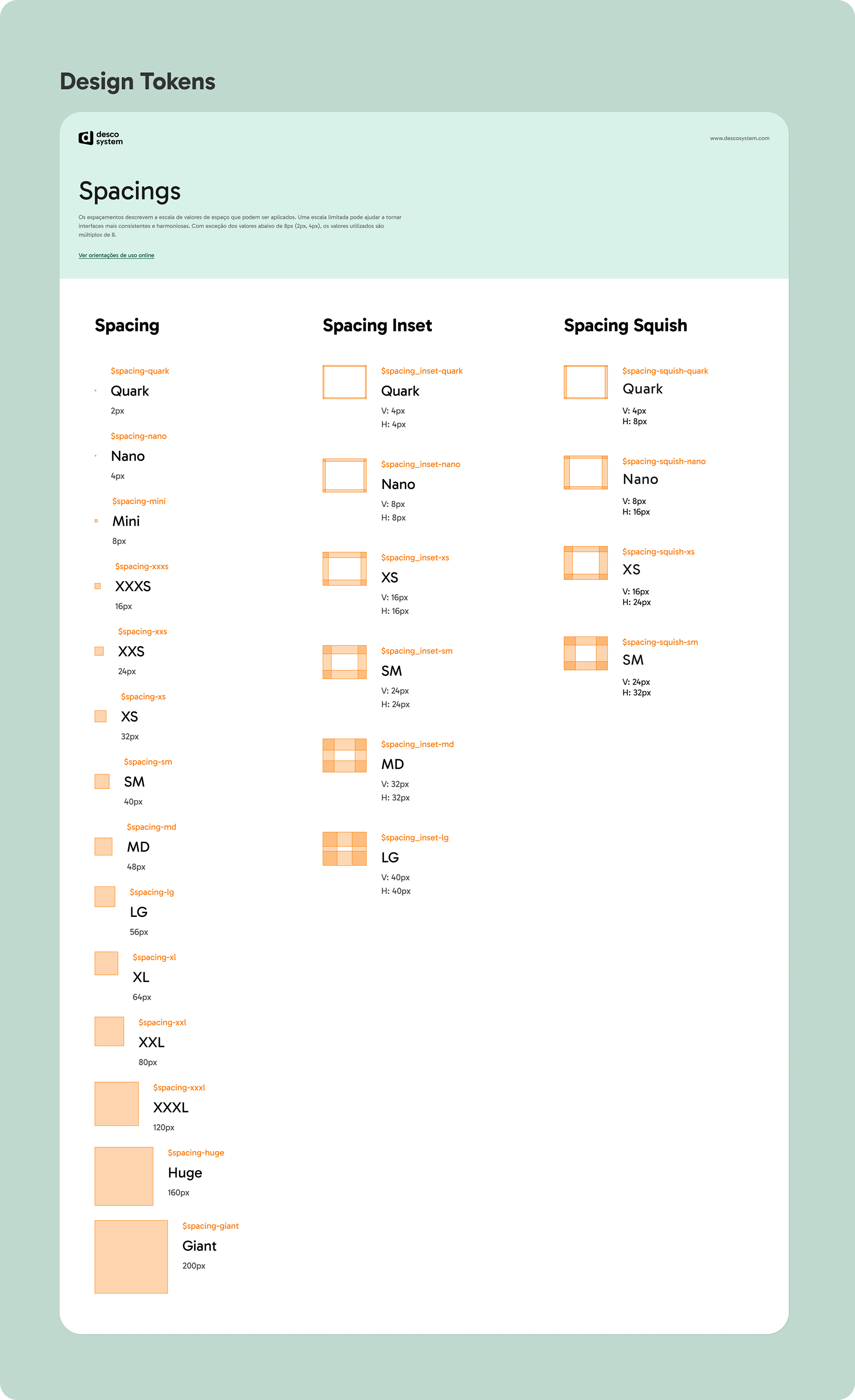
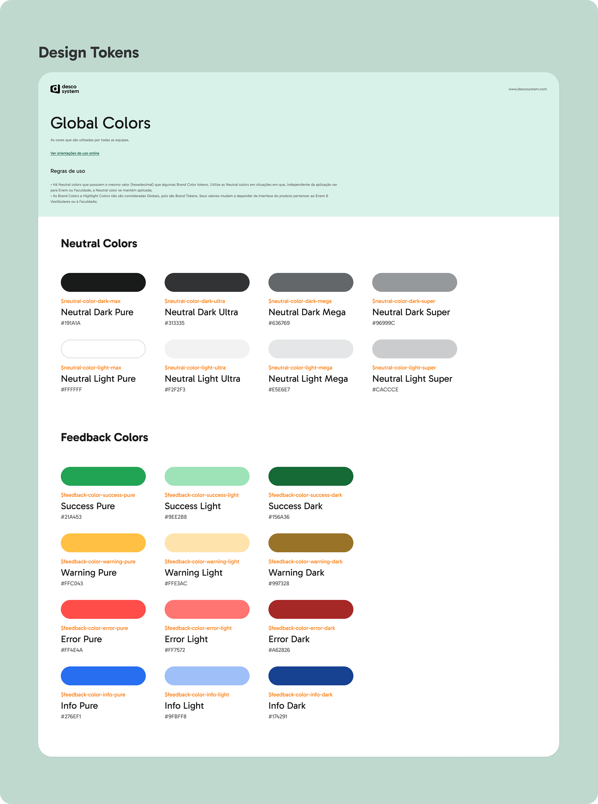
Design Tokens
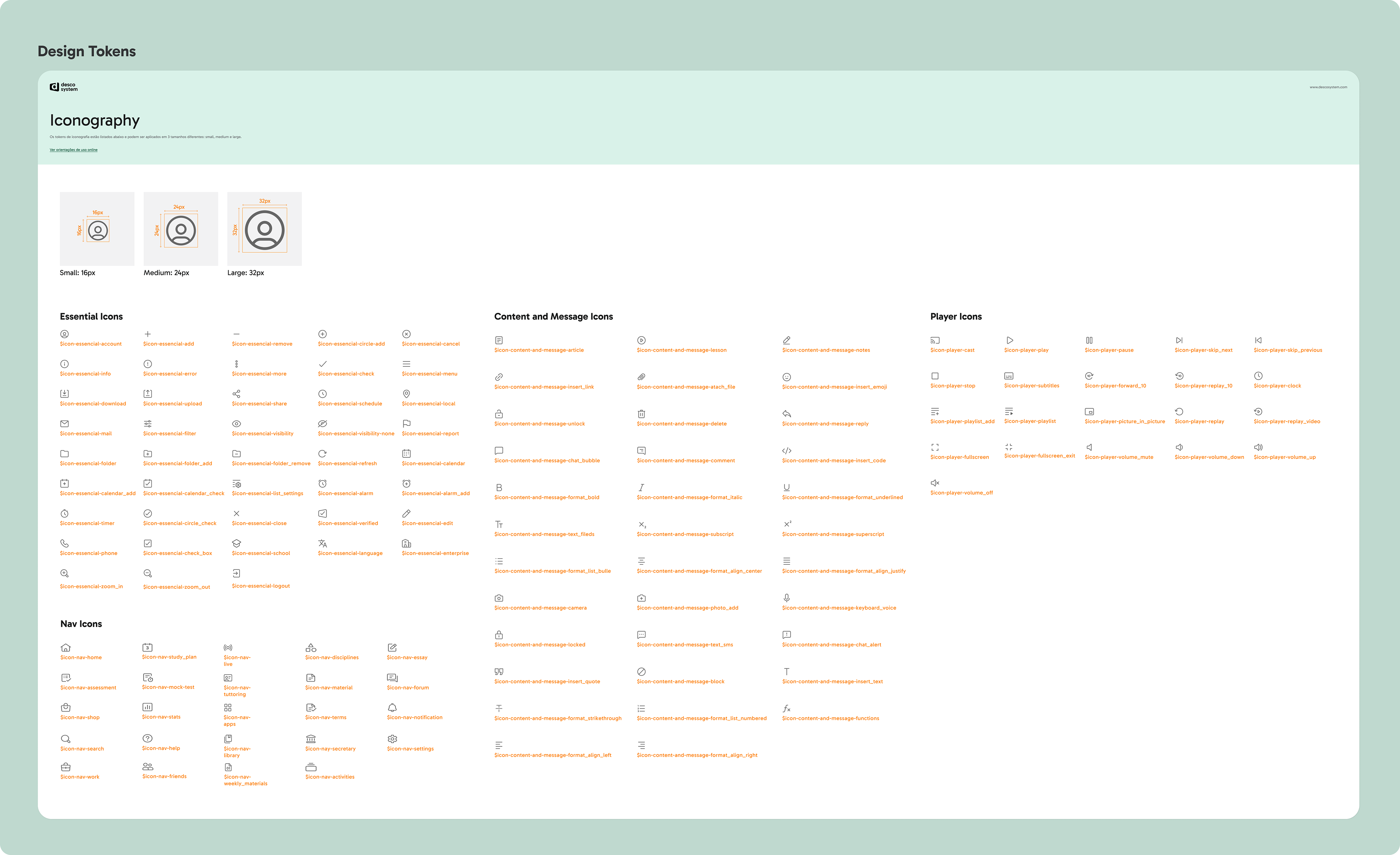
List of all DS tokens: color, font-family, line height, font weight, font size, border radius & width, opacity & shadow level, spacing inset, stack, squish, and inline.
List of all DS tokens: color, font-family, line height, font weight, font size, border radius & width, opacity & shadow level, spacing inset, stack, squish, and inline.
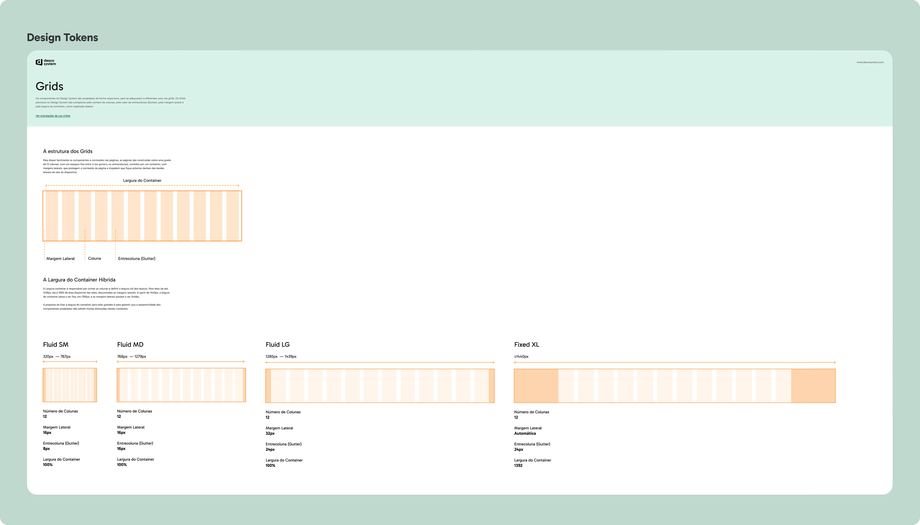
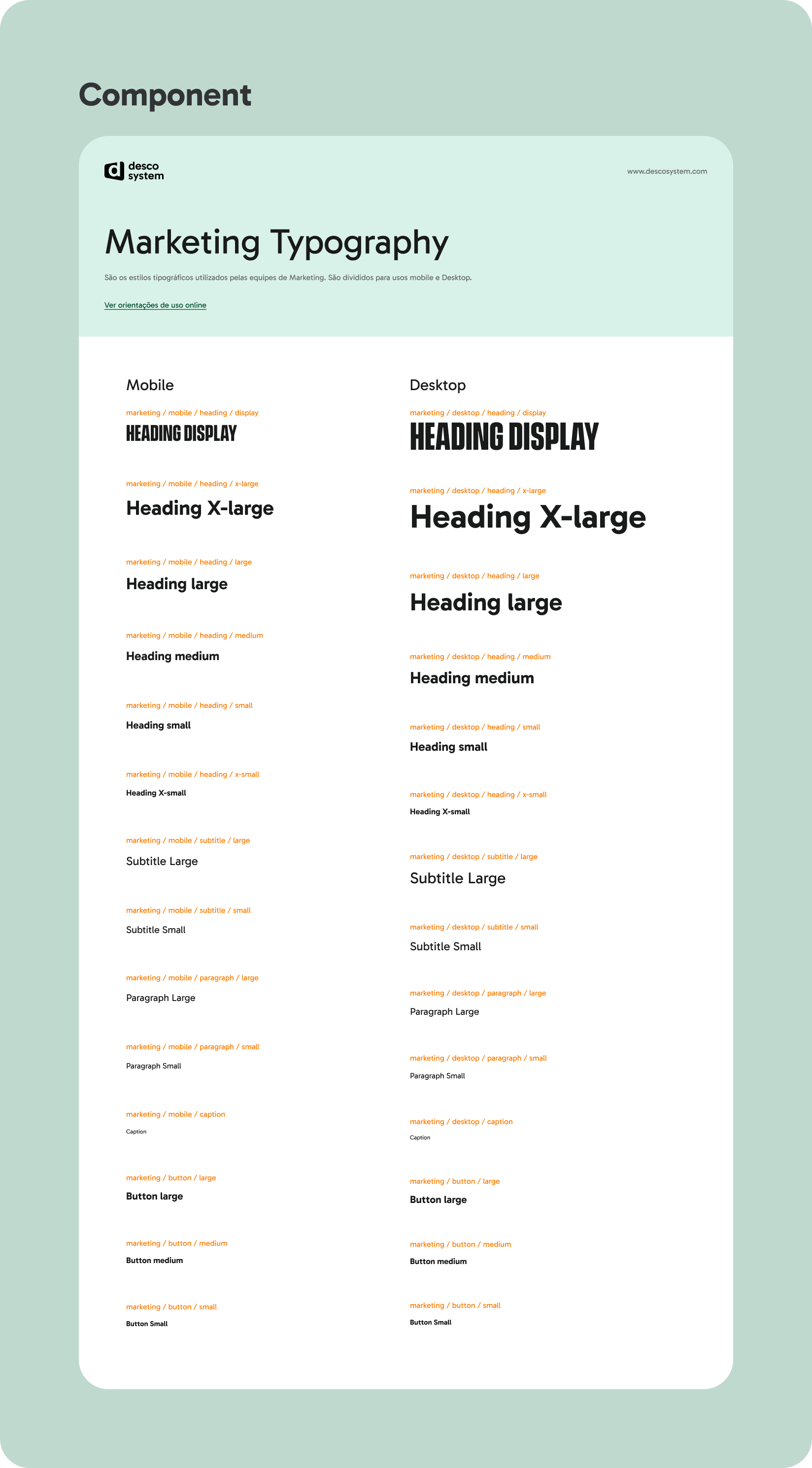
Guidelines
Basic description of the DS basic elements: grid, accessibility, content, icons, illustrations and motion.
Basic description of the DS basic elements: grid, accessibility, content, icons, illustrations and motion.
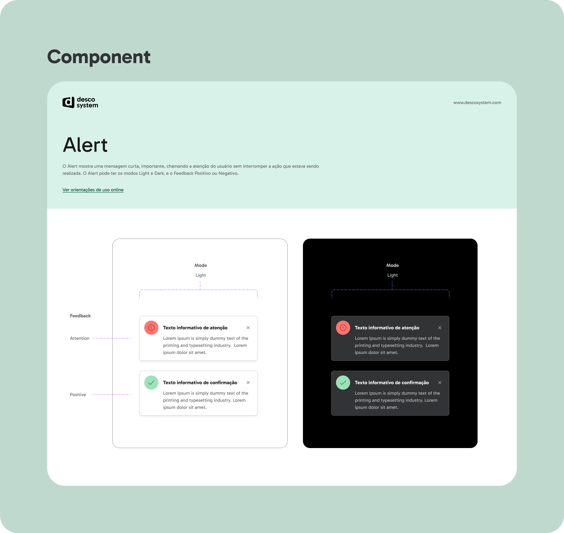
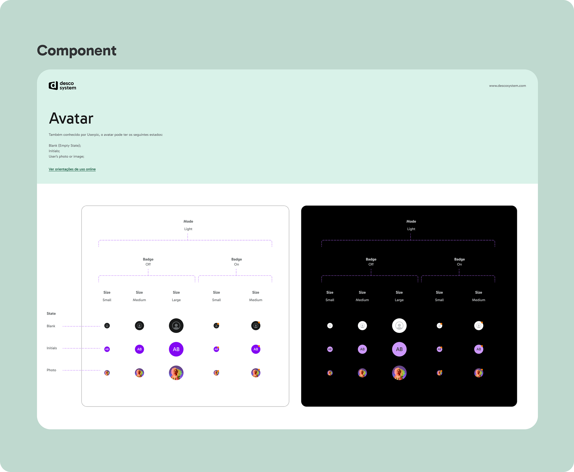
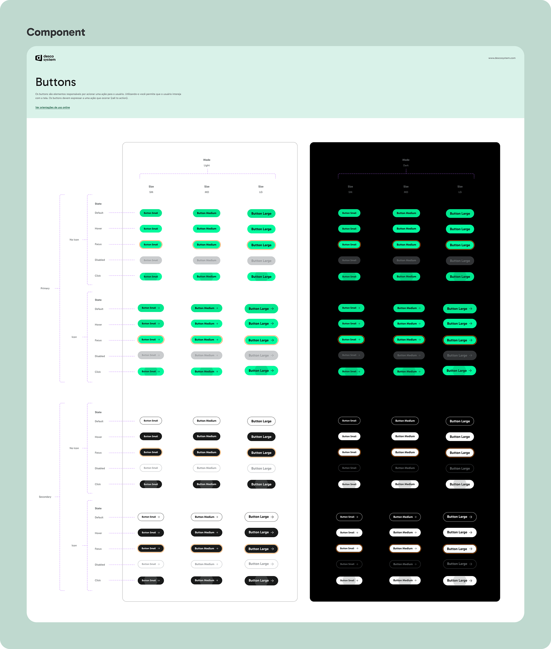
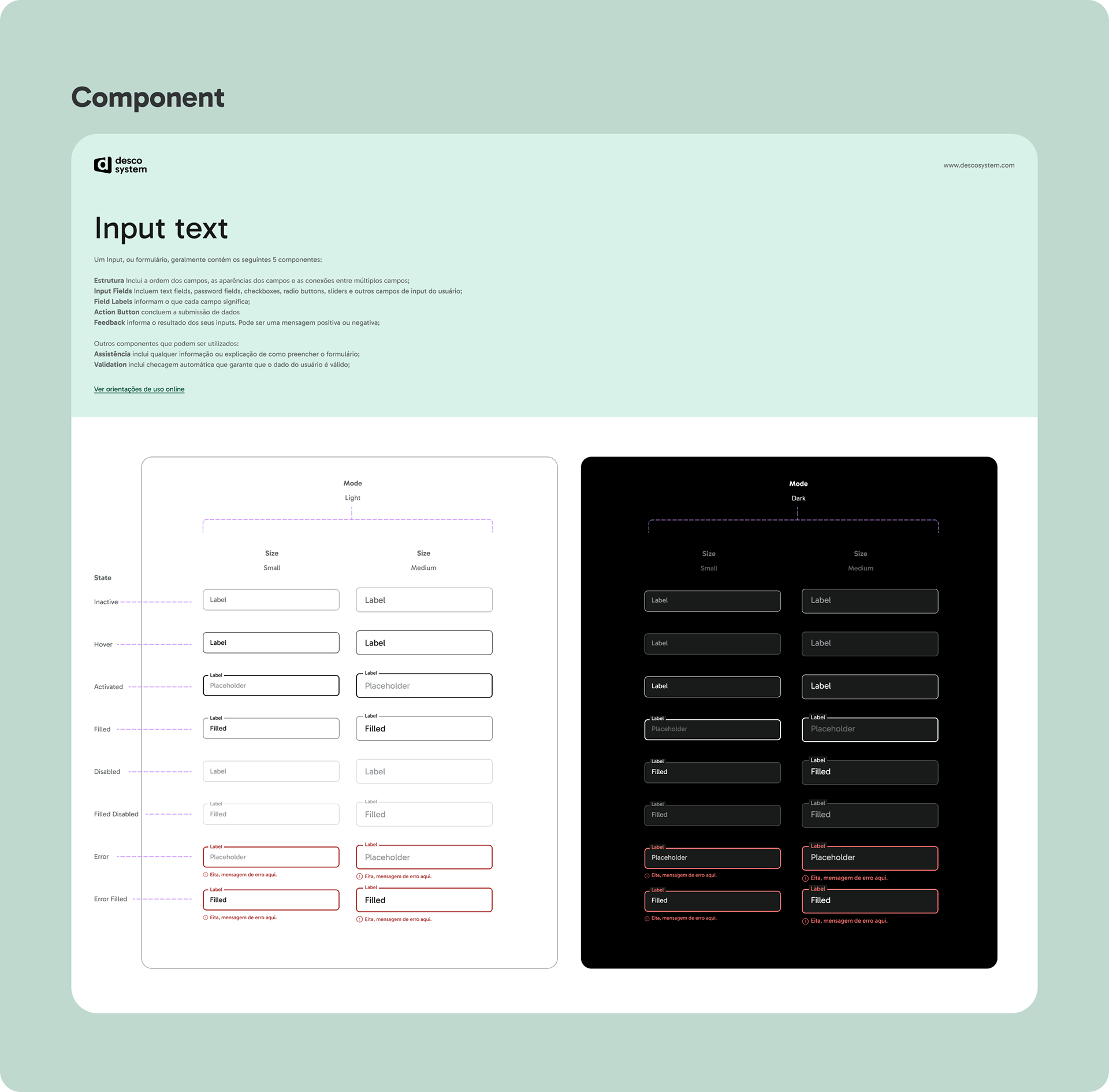
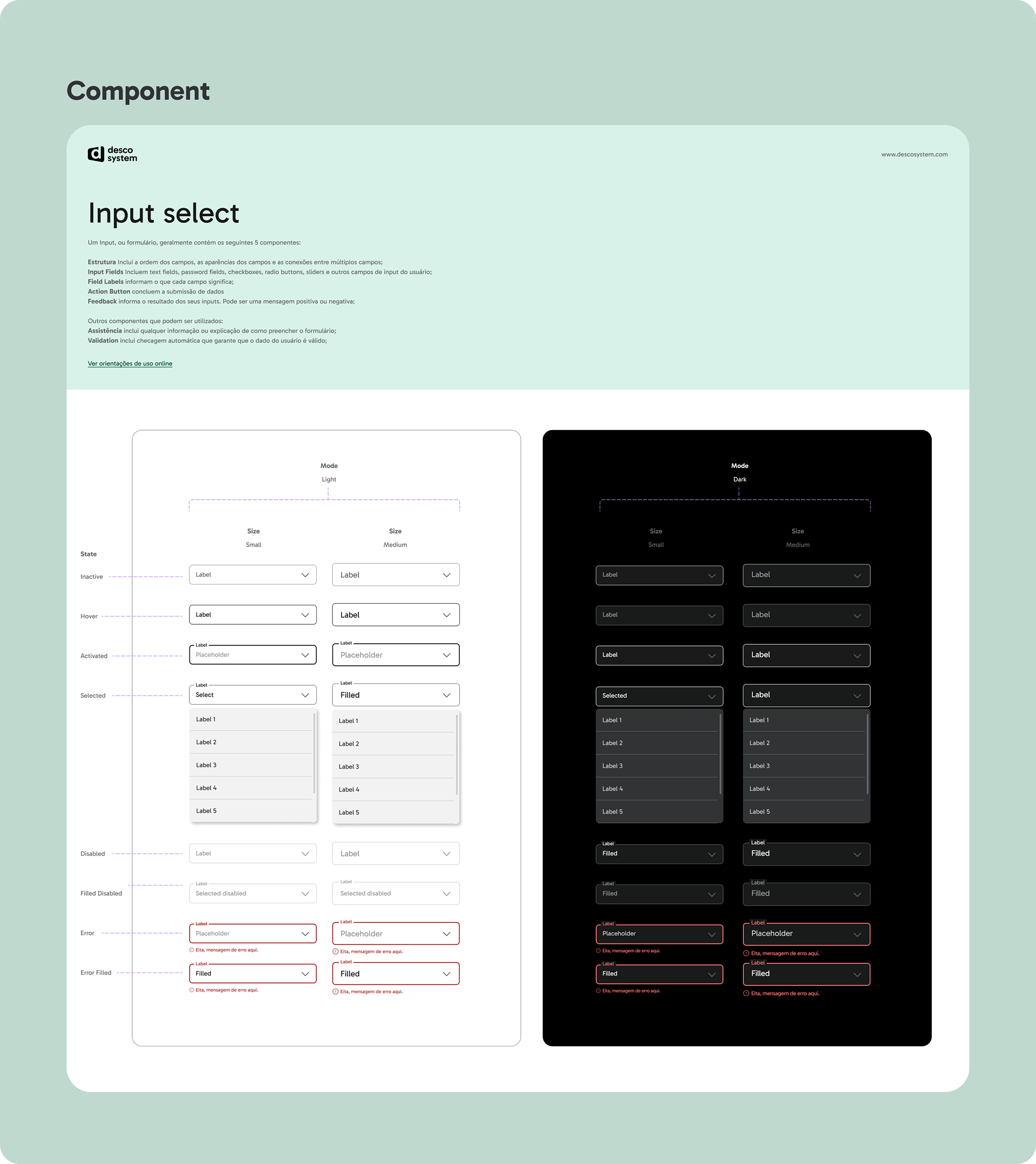
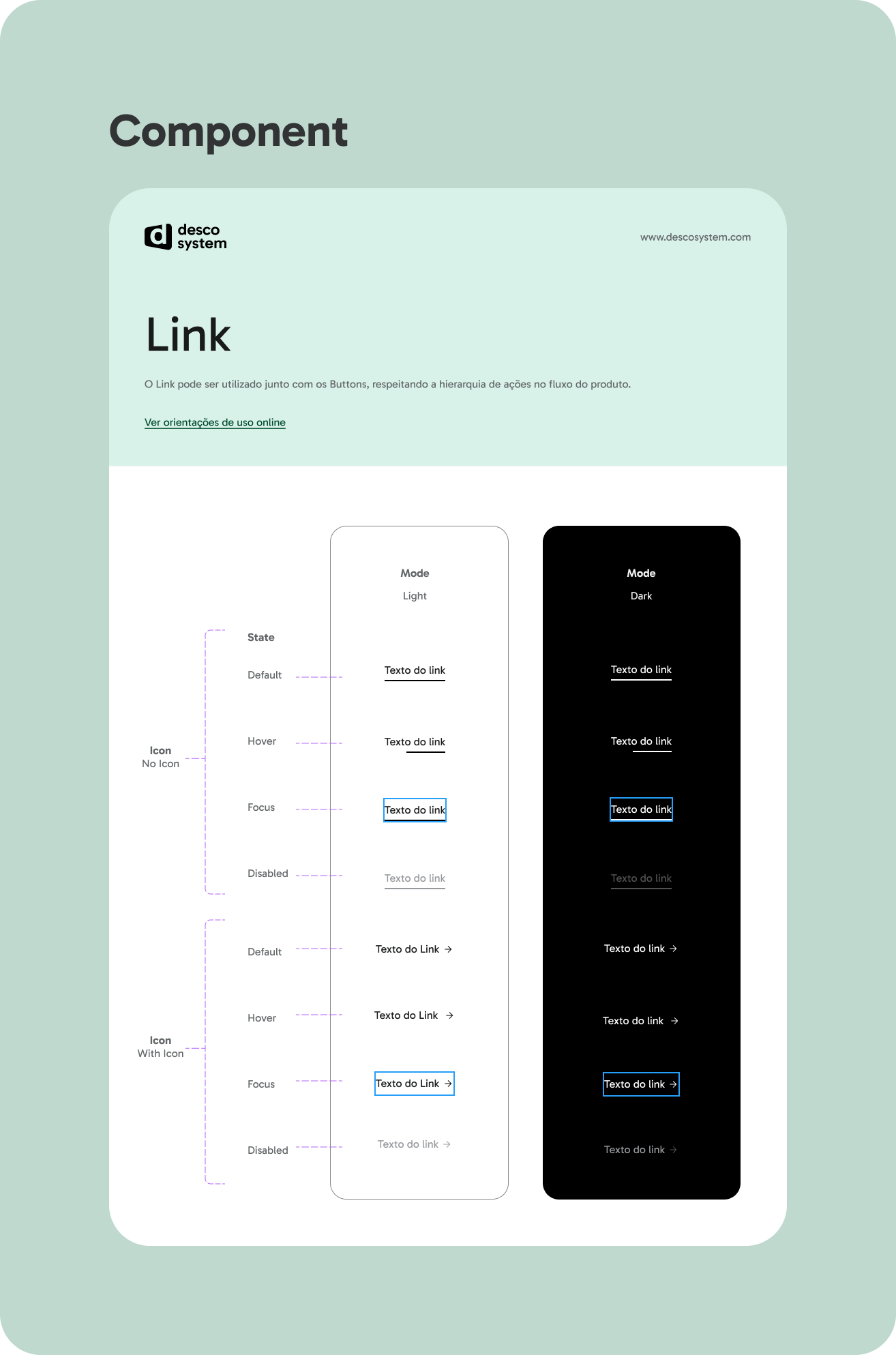
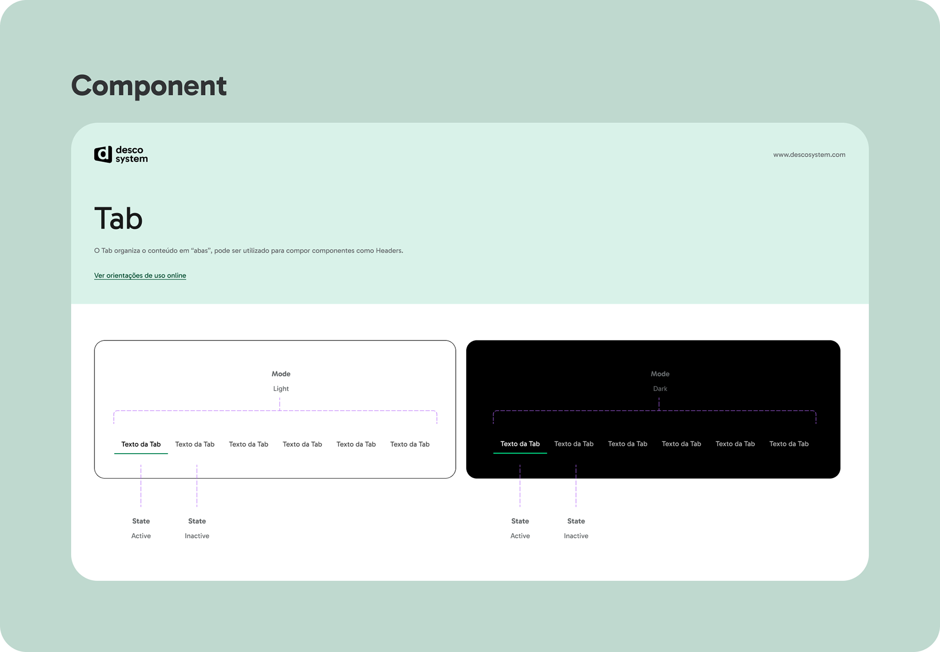
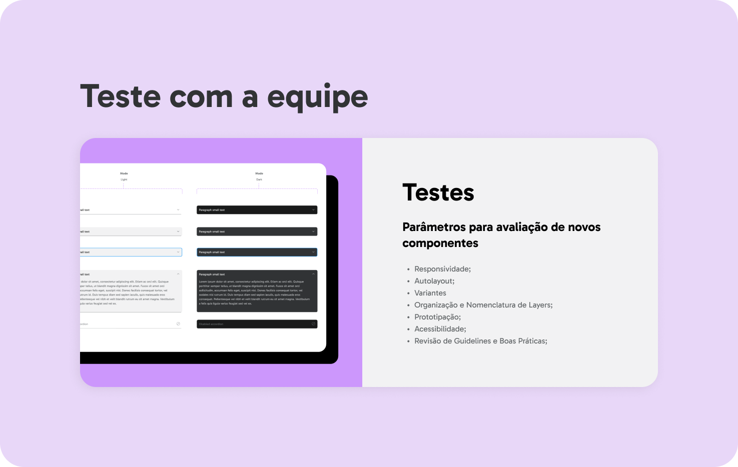
Components
Use, layout, content, behavior and interaction of all DS components.
Use, layout, content, behavior and interaction of all DS components.
Continuous Optimization
The DescoSystem Version 1.0 launch marked a major milestone in standardizing design operations. Early feedback from teams showed enthusiasm for the centralized components and improved workflows. Future steps include expanding the component library, refining documentation, and measuring adoption rates to guide updates.
By prioritizing collaboration, scalability, and consistency, the DescoSystem is helping Descomplica deliver cohesive and efficient design experiences across its platforms.